A Guide to Multi Page Message Boards
July 1, 2026 · Captain
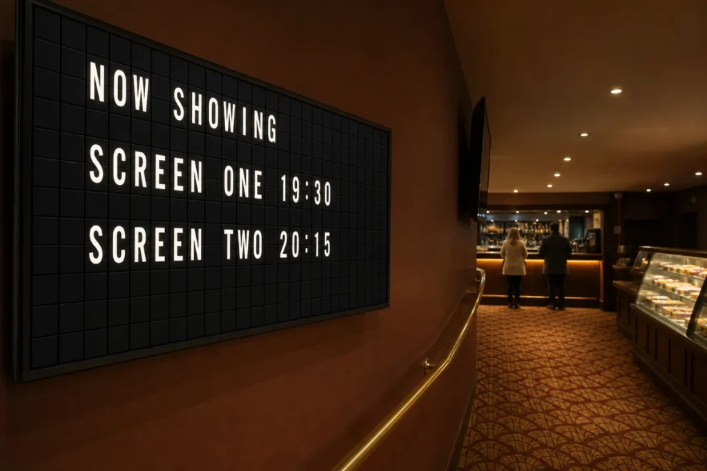
The problem usually starts with success. Your cafe adds breakfast, lunch, happy hour, Wi-Fi details, event nights, and seasonal specials – and suddenly one sign is doing too much. That is exactly where a guide to multi page message boards becomes useful. Instead of cramming every update into one crowded layout, you rotate clear, focused messages across multiple pages and let the board do the work.
For customer-facing spaces, that shift matters more than it sounds. A good message board is not just a place to post information. It shapes how organized your business feels from the moment someone walks in. When updates are clean, timely, and visually intentional, customers ask fewer repetitive questions and staff spend less time pointing at paper signs taped to walls or counters.
What a guide to multi page message boards should actually solve
A multi page message board is simple in concept. One display cycles through several text-based screens, each dedicated to a different message set. The real value is not the page count itself. It is the ability to separate information by purpose, timing, and audience.
That matters because most businesses do not have one message. They have layers of messages. A bar may need one page for daily specials, another for upcoming events, another for house rules, and one more for private booking details. A boutique hotel may need check-in instructions in the morning, neighborhood recommendations in the afternoon, and event notices in the evening. Trying to force all of that into a single board usually creates visual noise.
Multi page boards solve this by pacing information instead of piling it up. Customers see one clear idea at a time. Staff get a system that is easier to update. The space feels more deliberate, less improvised.
Why multi page message boards work so well in busy spaces
The best public-facing signage is legible at a glance. That is especially true in restaurants, lobbies, retail counters, and waiting areas where people are moving, talking, and making quick decisions. A dense screen with too much text often gets ignored, even when the information is useful.
Multi page message boards create rhythm. One page answers a practical question. The next reinforces the mood of the space. Another highlights something timely, like a special, a policy update, or tonight’s event. With a split-flap style display, that rotation has extra presence because the page change itself becomes part of the experience. The familiar click-clack motion catches the eye without relying on flashy graphics or overdesigned animation.
That is an important distinction. For brands that care about atmosphere, not every screen should behave like a modern ad panel. Some environments benefit from restraint. Text-first, split-flap-inspired boards feel elegant, memorable, and useful at the same time.
How to plan a guide to multi page message boards that stays readable
The easiest mistake is treating extra pages as extra space to say everything. In practice, more pages only help if each one has a job.
Start by grouping content into categories. One category might be operational information like hours, Wi-Fi, or ordering instructions. Another might be promotional content like specials, featured items, or events. A third could be brand or atmosphere content, such as a welcome message or neighborhood note. When those categories are separated, each page becomes easier to scan.
Then think about dwell time. If customers only have a few seconds at the host stand, you should not build a 10-page loop. If they are waiting in line for coffee or standing at a hotel front desk, a slightly longer rotation can work. The right number of pages depends on how long people naturally look at the display and how urgently they need the information.
Message length matters just as much. Shorter copy almost always performs better on a rotating board. A page should communicate one idea fast. If a sentence feels cramped, it probably is. Edit until the page reads cleanly from a distance.
Best use cases for multi page message boards
Restaurants and bars are natural fits because information changes constantly. Specials, happy hour times, event announcements, reservation notes, and kitchen updates all need room, but they do not need to appear at once. A rotating board keeps the front of house polished while making updates easier during a busy shift.
Retail stores benefit in a slightly different way. One page can feature store hours or pickup details. Another can call out promotions or new arrivals. Another can answer repeat questions like return windows or fitting room status. The board becomes both service tool and brand detail.
Hotels and hospitality spaces often use multi page boards to balance utility with ambiance. Guests want practical information, but they also respond to presentation. A beautifully timed rotating board can share check-in reminders, breakfast hours, event listings, and local guidance without looking transactional.
Offices, coworking spaces, and reception areas also gain from the format. Multi page boards can cycle through visitor instructions, room schedules, internal announcements, and welcome messages. In these spaces, the board quietly reduces friction while making the environment feel more considered.
Common trade-offs to consider
More pages are not always better. If your loop is too long, viewers may miss the page they need and walk away before it returns. That can be frustrating when the board contains essential information. In those cases, the strongest approach is often a shorter loop with only the highest-priority updates.
There is also a branding trade-off. A message board can either act as a utility-first tool or as a mood-setting display, and most businesses want some mix of both. The right balance depends on the setting. A fast casual shop may prioritize speed and clarity. A design-forward wine bar may allow more atmospheric pacing because the display is part of the room’s character.
It also depends on who updates the board. If multiple staff members will manage content, the system needs guardrails. Too many pages without a clear structure can lead to inconsistent tone, outdated messages, or repetitive content. The cleaner the publishing workflow, the better the board performs over time.
Building a page rotation that feels intentional
A strong rotation usually starts with a lead page. This is the message most people need most often: order here, today’s specials, front desk hours, or welcome information. After that, supporting pages can carry lower-priority content.
Timing should match content importance. Core operational messages should appear more often than occasional promotions. If one page contains essential instructions and another promotes an event next month, those pages should not receive equal exposure. This sounds obvious, but many businesses set identical timing for every page and end up giving minor messages too much room.
Visual consistency helps too. Keep the same layout logic across pages so the board feels unified, not random. With split-flap-inspired displays, that consistency is part of the appeal. The board should look like one composed system, not a slideshow stitched together in a rush.
This is where a platform like Split Flap TV fits naturally. The real advantage is not novelty. It is the ability to manage rotating, text-led displays with the charm of classic split-flap boards and the convenience of modern app-based control. You get the nostalgic public-display energy people remember, paired with practical tools like scheduling, page control, and fast updates from anywhere.
A simple framework for keeping content fresh
The businesses that get the most from multi page message boards usually follow a light rhythm. Evergreen pages stay stable. Time-sensitive pages change weekly or daily. Event-driven pages appear only when relevant. That keeps the board active without turning it into another chore.
It also helps to ask one simple question before adding a page: does this deserve its own moment? If yes, give it a page. If not, combine it or cut it. That standard protects readability.
A message board should reduce clutter, not relocate it. The goal is elegant communication that works in real life, during real shifts, with real customers glancing up while carrying a bag, waiting for a drink, or checking in after a long day.
The best multi page boards feel easy because someone made thoughtful choices behind the scenes. Keep the messages short, the rotation purposeful, and the presentation consistent. When the board sounds clear and looks composed, the whole business feels more confident.