
A Practical Guide to Branded In-Store Messaging
July 15, 2026 · Captain
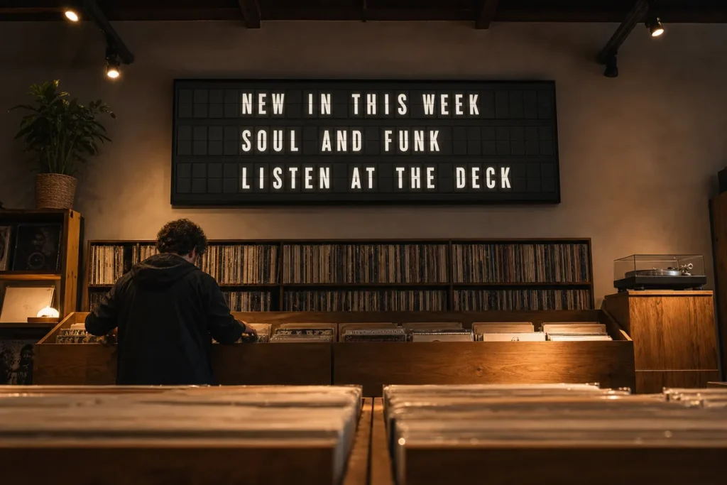
A customer reaches the counter, pauses, and asks the question your staff answered six times yesterday: “What are today’s specials?” The answer may be simple, but a taped printout, a smudged chalkboard, or a handwritten note on the register can make the whole space feel less considered. This guide to branded in-store messaging is about turning those routine questions into a polished part of the customer experience.
For restaurants, retail shops, hotels, bars, and busy offices, in-store messaging is not just promotional copy. It is the information people need at the exact moment they need it: where to order, what has changed, when an event starts, whether the Wi-Fi is available, or what makes today worth trying. Done well, it saves staff time while giving the brand a stronger voice in the room.
What branded in-store messaging really means
Branded in-store messaging is the system of words, visuals, placement, and timing a business uses to communicate inside its physical space. It includes the obvious pieces, such as menu updates and promotional messages, but it also includes the useful details that keep a visit moving smoothly.
The branded part matters. A notice that says “Restroom out of order” may be functional, but it can still sound like your business. A boutique hotel might write, “A quick refresh is underway. Please use the lobby restroom.” A neighborhood bar could keep it direct and friendly. The information remains clear, while the tone belongs to the space.
This does not mean turning every message into an advertising line. Customers notice when a business tries too hard. The best messages are concise, helpful, and visually consistent enough that they feel intentional rather than improvised.
Start with the moments that create friction
Most businesses do not need more signs. They need fewer, better messages in the right places. Start by looking for the points where customers hesitate, ask for help, or miss information that is already technically available.
At a cafe, that may be a changing pastry list, an afternoon happy hour, or an instruction to order at the counter. In a store, it could be fitting room policy, return information, a limited collection, or a pickup reminder. At an office, it is often meeting schedules, visitor directions, or announcements that otherwise disappear into a crowded email inbox.
Write down the questions staff hear repeatedly over one week. Then separate them into two groups: permanent information and changing information. Permanent information deserves a stable home. Changing information needs a display format that can be updated quickly, without designing and printing a new sign every time something shifts.
This audit also reveals what not to say. If a message only exists because the layout is confusing, improving the customer flow may be more effective than adding another notice.
Give every message one job
A strong in-store message should answer one clear question or prompt one clear action. When a screen, sign, or board tries to announce five things at once, customers tend to retain none of them.
For example, “Today: espresso tonic, turkey pesto sandwich, and lemon cake” works because it has one job: highlight current offerings. “Happy hour starts at 4 PM” has a different job: create a reason to return or stay. Put them on separate pages, at separate times, or in separate zones rather than forcing them into one crowded block.
Use a simple hierarchy when writing: lead with the detail that matters most, then add only the context needed to act. “Kitchen closes at 9 PM” is stronger than “Please note that our kitchen will be closing this evening at the time of 9 PM.” Short copy feels more confident, reads faster, and suits the pace of a public space.
Match the message to the distance
A customer walking past a window has only a few seconds. They need large type, a short phrase, and a reason to look again. Someone standing in line can absorb more detail. Someone seated at a table may have time for a rotating schedule, event listing, or a few well-chosen recommendations.
Distance changes what good messaging looks like. If people need to step closer to read the important part, the message is probably doing too much. Text-led displays work especially well for crisp, timely information, but only when the hierarchy is built for real viewing conditions rather than a laptop screen.
Build a recognizable voice, not a wall of copy
Your wording should carry the same character as your space. A polished hotel may be calm and precise. A record shop can be more playful. A restaurant with a classic atmosphere may favor warmth and restraint over exclamation points and trend-heavy language.
Choose a few voice rules your team can actually use. Perhaps your brand is concise, welcoming, and lightly witty. Perhaps it avoids jargon and always names the next step. These rules are more useful than a long style guide because they make quick updates easier during a busy shift.
Consistency includes visual choices, too. Keep type styles, capitalization, color, and spacing aligned across messages. A few carefully selected colors usually create more impact than a different palette for every announcement. The goal is not to make every page identical. It is to make every page feel like it belongs in the same place.
A split-flap-inspired display adds another layer of character. The familiar click-clack rhythm and letter-by-letter motion turn a simple update into a small public moment. That visual theater is valuable, but it should support the message rather than delay it. Use animation to introduce a new line, transition between pages, or draw attention to a timely update. Keep essential information visible long enough to read.
Plan content by time, not just by topic
The most useful messaging changes with the day. Morning guests may need opening hours, breakfast specials, or commuter-friendly offers. Midday messaging can direct lines and feature fast options. Evening content can shift toward events, reservations, drink specials, or closing reminders.
Scheduling lets a business prepare those moments ahead of time instead of relying on someone to remember a stack of signs. It also reduces the risk of yesterday’s offer remaining on display after it ends. For operators managing multiple tasks at once, that accuracy is as valuable as the design.
A practical content calendar can cover four categories:
- Daily updates, such as specials, availability, and operating changes
- Weekly rhythms, such as recurring events or team schedules
- Seasonal moments, such as holiday hours and new collections
- Unexpected notices, such as weather changes or temporary closures
Leave room for the unexpected. A good system should make a last-minute update feel like a quick edit, not a production project. Cloud-managed messaging is particularly useful here because the person with the information can publish it without being physically beside the display.
Choose placement with intention
Placement decides whether a message is useful or invisible. Entryway displays are best for setting expectations: hours, a welcome, key events, or a simple orientation cue. Queue areas are ideal for menus, add-ons, wait times, and short brand moments. Near the point of purchase, use messaging to clarify the next step or highlight a timely choice.
Do not place crucial information where people are already moving too quickly to see it. Likewise, do not put a long schedule at the entrance if customers need it after they have settled in. Watch how people move through the room, then place information just before the moment they need to make a decision.
One display can serve several roles through scheduled pages, but there is a trade-off. A single screen rotating through many messages is efficient, yet someone may miss the one detail they came to find. If an instruction is essential, give it a consistent page, a frequent rotation, or a dedicated location.
Keep control simple for the people doing the work
A beautiful messaging system fails if only one person knows how to update it. The process should be clear enough for a manager to change a special between shifts and structured enough that the brand does not drift.
Create a small library of approved layouts for the updates you make most often. A daily special, event announcement, welcome message, and service notice can each have a ready-made format. Team members then replace the details rather than rebuilding the design from scratch.
Split Flap TV is designed around that practical reality: a prepared screen and app-based controls give businesses a way to publish text-led, split-flap-style content without mechanical hardware or a complicated AV setup. Layouts, pages, timing, colors, and scheduled content can be adjusted from one central place, so the display can keep pace with the business.
Before publishing, use a quick check: Is the message accurate? Can it be understood at the intended viewing distance? Does it tell the customer what to do or know next? Is it still relevant at the time it will appear? Those four questions catch most of the problems that make signage feel careless.
Keeping Opening Hours Accurate Everywhere They Appear
Customers will forgive a long line or a sold-out special. Arriving during your posted hours to find a locked door is harder to shrug off, because it feels avoidable. Hours usually live in more places than teams realize: the front door, the host stand, the register, a lobby screen, sometimes a window card. The weak point is rarely the hours themselves. It is the process. A manager updates the door decal but forgets the register sign, or a holiday schedule stays up a week too long.
The fix is to treat hours as operational content rather than a static sign, managed from one source of truth and one control point. A few habits keep it reliable:
- Be specific. “Open daily” tells customers very little. “Mon-Thu 8 AM-7 PM, Fri-Sat 8 AM-9 PM, Sun 9 AM-5 PM” gives them certainty.
- Spell out separate service windows. If the kitchen closes before the bar, or breakfast has its own hours, say so plainly.
- Schedule known exceptions. Holiday hours, event closures, and seasonal changes can go live on the right morning and expire on their own.
- Assign one owner for official hours and review upcoming exceptions weekly, while keeping a quick way to push same-day corrections when staffing or weather changes the plan.
The entrance is non-negotiable, since that is where people decide whether to come in, wait, or leave. Inside, place hours where questions tend to start, such as a check-in desk, pickup area, or elevator lobby. In hotels and offices, amenity hours often matter as much as the building’s opening times.
Designing Messages for the Shop Window
At street level, you have a few seconds to earn a glance, and window screens face conditions an interior display does not. Light shifts through the day, reflections cut into visibility, and most passersby are moving rather than standing still. A fast-walking pedestrian may catch just one page, while someone waiting outside might read several. Put your most important message first and repeat it often.
Keep window copy short and specific, more like a host greeting people at the door than an ad campaign. Hours, sold-out notices, happy hour timing, walk-in availability, or a private event closure are the kinds of details that shape foot traffic. If people tend to hesitate before entering, use the screen to remove that friction. One strong message will outperform five average ones. A text-led window screen is not the right fit for every business, though: if your messages almost never change, a permanent sign may be enough, and if your brand depends on photography or product video, a text-first display may be too restrained to carry it alone.
Handling Live Changes During a Rush
Instant updates matter most when the room is busiest, which is also when mistakes happen. The fastest path is to let the person who knows about the change publish it, whether that is the shift lead, the front desk manager, or the owner. Divide responsibilities so the look stays protected without creating a bottleneck: a manager might control availability and service hours, a marketing lead might own recurring promotions, and in larger venues one person can approve templates while trusted staff fill in the daily details. Keep naming consistent, too. If it is “TODAY’S SPECIAL” on Monday, it should not become “FEATURED ITEM” on Tuesday without a reason.
Before service, run through the publishing routine once. Check that the right screen is selected, the text reads well from the intended distance, and the page order makes sense. That short check prevents the classic error of sending the right message to the wrong display.
Scheduled content is only as accurate as the plan behind it. If a holiday shifts your hours or a private booking runs long, someone needs the authority to override the planned message, so build that check into opening or closing. Live data needs the same editorial eye: watch for awkward abbreviations, broken line breaks, and what the board shows when a source has nothing new. A blank or garbled display does not look modern. It looks unattended.
Measure what people do, not just what looks good
A display can be beautiful and still miss its operational purpose. Ask staff whether the same questions are being asked less often. Notice whether guests arrive at the counter ready to order. Track attendance for events featured in-store, or compare uptake of an item when it is displayed clearly versus when it is only mentioned verbally.
Customer behavior is the best feedback. If people glance at a message but still look confused, simplify the wording or move it closer to the decision point. If an update gets noticed but feels out of place, revise the tone or the visual treatment. Small adjustments made consistently are how an in-store system becomes genuinely useful.
The most memorable spaces do not communicate by shouting. They make the right information feel like part of the atmosphere: clear when it needs to be clear, distinctive enough to be remembered, and easy to change when tomorrow brings a different message.