
What Makes an Authentic Click Clack Display Effect?
July 9, 2026 · Captain
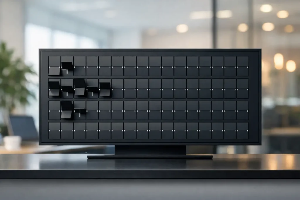
You can spot a fake split-flap look in seconds. The movement is too smooth, the timing is off, the letters feel weightless, and the whole thing reads like a novelty filter instead of a real public display. An authentic click clack display effect is different. It has rhythm, restraint, and a physical feel that makes people look twice, even when the message itself is simple.
That distinction matters more than it might seem. For a cafe changing specials, a hotel posting guest info, or an office sharing wayfinding, the display is not just carrying text. It is setting a tone. When the split-flap effect feels authentic, it adds theater and credibility at the same time. When it feels generic, it becomes decoration.
Why the authentic click clack display effect stands out
Classic split-flap boards earned attention long before modern screens took over. They were used in stations, airports, and public venues because they could present changing information clearly, at scale, with a memorable mechanical cadence. People did not just read them. They heard them, anticipated them, and trusted them.
That is the real power behind the style. The click-clack is not nostalgia for nostalgia’s sake. It signals change. It tells the viewer that something has updated right now. In a business setting, that can be surprisingly useful. A rotating happy hour menu, room assignment board, event schedule, or house message feels more alive when the update has a visible and audible transition.
There is also a branding effect. Many digital screens try to impress by doing more – more color, more motion, more visual layers. Split-flap goes in the opposite direction. It wins with focus. Mostly text, disciplined layout, and a signature movement. That restraint is exactly why it cuts through.
What actually makes it feel authentic
An authentic click clack display effect is not just a font plus a sound file. It comes from several small details working together.
The motion has to feel mechanical
Real split-flap boards do not animate like polished app transitions. They flip with a slight sense of resistance and progression. Characters do not melt into place. They cycle through positions, then settle. Good digital recreation captures that physical logic.
If the animation is too fast, it loses drama. If it is too slow, it becomes distracting. The sweet spot depends on viewing distance and how often content changes, but the principle stays the same: the movement should feel intentional, not flashy.
The best versions also avoid overanimating every update. Sometimes the whole board flipping at once creates impact. Other times, selective changes feel more natural. A restaurant updating one line on a specials board does not need a full-screen spectacle every minute.
The sound should support, not overwhelm
The click-clack matters because it completes the illusion. Without sound, the display can still look strong, but it loses one of the sensory cues that people associate with split-flap boards. With sound, the experience becomes instantly more recognizable.
Still, this is where context matters. In a busy lobby, retail floor, or bar, optional sound can add exactly the right amount of atmosphere. In a quiet office or small waiting room, full-volume effects may be too much. Authenticity is not about forcing every detail at maximum intensity. It is about choosing the right level for the space.
The typography and spacing need discipline
Traditional split-flap boards were built around structure. Every character sat inside a consistent cell. Rows lined up. The board had order. If a digital version uses loose spacing, inconsistent proportions, or overly stylized type, the effect falls apart fast.
A convincing display uses typography that feels engineered rather than decorative. The layout should breathe, but not drift. Text needs to remain highly legible from a distance, because that is part of the heritage of this format. It was made for public reading, not just visual charm.
The layout should look like signage, not a slideshow
This is where many imitations miss the mark. They borrow the flip animation but treat the screen like a generic content player. Add too many colors, crowded blocks, or promotional graphics, and the split-flap character gets diluted.
Authentic split-flap-inspired signage works best when it respects the original medium. Rows, columns, clear hierarchy, limited distractions. That does not mean it has to look old-fashioned. It means the design should feel purposeful. Modern control with classic display logic is the sweet spot.
Why businesses care about authenticity
For most operators, authenticity is not an abstract design debate. It affects whether the display feels premium or gimmicky.
A boutique hotel using a split-flap style welcome board wants guests to feel that the space has personality. A coffee shop posting daily specials wants the board to look polished, not homemade. An office manager wants wayfinding and internal messages to feel organized without looking cold. In each case, the display is doing two jobs at once – communicating information and shaping the environment.
That is why the authentic click clack display effect works so well in customer-facing spaces. It has presence without shouting. It creates motion without requiring video-heavy content. And it gives businesses something many standard screens do not: a memorable display language people actually notice.
There is also a practical side. The old split-flap look is naturally suited to short, changing text. Hours, offers, names, events, announcements, directional cues – these are exactly the kinds of messages businesses update constantly. When that content lives on a cloud-managed display instead of taped paper signs or handwritten boards, the retro charm starts earning its keep.
Authentic does not mean mechanical hardware
This is the key shift for modern venues. Many people love the look and sound of classic split-flap boards, but very few want the upkeep that comes with physical mechanical systems. They are beautiful, but they are also specialized objects with limits.
A screen-based system can preserve the emotional appeal while making the day-to-day experience dramatically easier. You can update content instantly, control multiple displays, schedule messages ahead of time, and adapt layouts to fit the space. That matters when the lunch menu changes at 10:45, a private event needs signage by 5:00, or a front desk wants tomorrow’s welcome message ready tonight.
This is where authenticity has to be balanced with usability. If a digital split-flap solution chases realism so hard that it becomes difficult to read, slow to manage, or rigid in format, it misses the point. The best systems keep the soul of the medium while making it useful for modern operations.
Where the effect works best
Not every business needs a dramatic visual system. But for spaces where atmosphere matters, split-flap style has unusual range.
Restaurants and bars can use it for menus, specials, and event nights. Hotels can use it for greetings, schedules, and lobby messaging. Retail shops can post promotions, store information, or rotating brand lines. Offices can clean up reception areas and internal communication without resorting to generic corporate screens.
Even within those categories, the right setup depends on traffic, distance, and message type. A street-facing window display may need fewer words and stronger pacing. An indoor host stand display can carry more detail. A quiet hospitality setting may lean on the visual animation and keep sound subtle or off. A high-energy venue may want the full click-clack effect because it becomes part of the room.
How to judge whether a display effect feels real
If you are evaluating a split-flap style system, trust your first reaction. Does it feel like signage with history behind it, or like a themed animation layer? Then look closer.
Pay attention to the flip behavior, the sound options, the order of the grid, and how the content sits on the board. Notice whether updates feel satisfying or chaotic. Ask whether the system can handle everyday business communication, not just demo messages.
That last point matters. Authenticity is not only aesthetic. It is operational. A board that looks right but is difficult to update will eventually become stale. A board that is easy to control but visually off will not deliver the experience you wanted. The strongest approach brings both together, which is exactly why businesses are turning to platforms like Split Flap TV instead of settling for paper signs or forgettable generic displays.
The magic of split-flap has always been simple: public information made visible, audible, and a little theatrical. When that feeling is recreated well, it does more than decorate a screen. It gives everyday messages a sense of occasion.