
7 Best Ways to Show WiFi Password in Store
July 7, 2026 · Captain
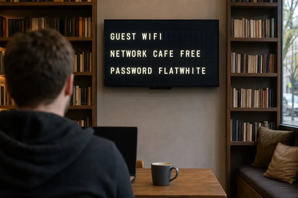
The WiFi question usually hits right when your line gets busy. Someone leans over the counter, asks for the password, your staff repeats it for the tenth time that hour, and suddenly a tiny piece of information has become a steady operational drag. The best ways to show wifi password in store are the ones that make access easy for guests without making your space look improvised.
That matters more than it seems. A WiFi sign is not just a utility notice. It is part of your customer experience, part of your visual language, and one more signal of whether the business feels intentional or patched together. In a boutique retail shop, cafe, hotel lobby, tasting room, or office reception area, the difference between a taped slip of paper and a well-placed display is the difference between clutter and control.
What the best ways to show WiFi password in store have in common
The strongest setups do three things well. They are easy to spot, easy to read, and easy to update.
That sounds obvious, but many stores get only one or two right. A handwritten note near the register is easy to update, but it often looks temporary even when it stays up for months. A framed print can look better, but if the password changes, somebody has to remake it. A verbal-only approach keeps walls clean, but it wastes staff time and creates friction for guests.
Good in-store communication should work during a rush, not just during a quiet afternoon. If customers can answer their own question in two seconds, your team gets those two seconds back again and again all day long.
Start with placement before format
Before choosing the sign itself, decide where people naturally look when they need WiFi. That is usually not the corner you happened to have available.
In most stores, the best locations are the entrance, checkout counter, waiting area, table area, or reception desk. In hotels and offices, the elevator lobby or front desk zone often makes more sense. The rule is simple – place the password where people pause, not where they pass.
Visibility also depends on distance. A small tabletop sign can work perfectly at a cafe register but fail in a larger retail space. A wall display might be readable from across a room, but if it competes with menus, promos, and directional signs, it becomes visual wallpaper. The best result is usually a dedicated message in a place with low visual noise.
Printed signs work, but they have limits
A clean printed sign is one of the simplest ways to show WiFi information. If your password rarely changes, this can be enough.
The catch is that printed signage tends to age badly. The design may start polished, but a new password, a scratched frame, a curled edge, or one more sticky note beside it changes the whole look. Small businesses feel this quickly because front-of-house details carry more weight when the space is intimate.
Printed signs also lock you into one message. If you want to show guest WiFi in the morning, happy hour specials in the afternoon, and a private event notice at night, static signage cannot keep up without constant swapping. That is fine for very simple use cases. It is not ideal for fast-moving ones.
QR codes are useful, but only when paired with clear text
A QR code can make access feel modern and fast. Guests scan, connect, and move on. For many stores, especially younger or more mobile-first audiences, that is a smart move.
But QR-only signage has a weakness. Not everyone wants to scan, and not every phone behaves the same way. Some people simply prefer seeing the network name and password in plain text. Others may hesitate if the code is unlabeled or looks unofficial.
The better approach is a hybrid one. Show the network name clearly, include the password if needed, and add a QR code as the shortcut. That way the sign serves everyone instead of assuming one behavior.
Table tents and countertop cards are good for close-range spaces
If customers spend time seated or waiting at a fixed point, table tents and countertop cards can do the job well. They bring the information close to the moment of need.
This works especially well in cafes, bars, salons, and reception areas where people are already looking down at menus, drink lists, service cards, or appointment details. The format feels natural there. It also keeps the message from competing with larger branding elements on the wall.
The trade-off is maintenance. Table pieces move, disappear, get stained, or end up turned around. If you use this method, it helps to treat it like any other front-of-house fixture and check it regularly.
Wall-mounted displays feel more deliberate
For stores that care about aesthetics, a dedicated wall-mounted message often lands better than a pile of small sign pieces. It looks intentional, and intention is a big part of perceived quality.
This can be a framed sign, a branded placard, or a digital display that rotates messages. The advantage is not just visibility. It is consistency. When the WiFi message lives in a designed, repeatable format, it becomes part of the store environment instead of an afterthought taped on at the last minute.
That is especially valuable in spaces where design is part of the product – boutique retail, hospitality, premium food and beverage, and client-facing offices. In those places, every sign says something about the brand, even when it is just sharing a password.
Digital signage is one of the best ways to show WiFi password in store
If your store changes messages often, digital signage is usually the cleanest option. It lets you show WiFi details when customers need them, then switch to hours, menus, event updates, or promotions without touching the display itself.
This is where a text-led format has a real advantage. WiFi credentials are not visual content. They are practical content. They need to be readable, prominent, and fast to update. A split-flap style display does that with more character than a generic screen and more polish than a printed note. The classic click-clack look draws the eye because it feels public, purposeful, and alive.
For shops and hospitality spaces, that blend matters. You are not just solving a utility problem. You are solving it in a way that supports the atmosphere of the room. A retro-inspired digital message can show the network name and password with clarity, then rotate to the next message on schedule. No tape. No marker. No reprints. Just one controlled system doing several small but useful jobs all day.
If the password changes, the update happens in software instead of at the front desk with scissors and laminated inserts. For operators managing busy teams or multiple locations, that convenience compounds fast.
Keep the password readable, not clever
A lot of WiFi frustration comes from formatting rather than security. Passwords packed with ambiguous characters are harder to share on signage, especially in low light or from a few feet away.
If you control the guest network, choose a password that avoids easy mix-ups like capital I and lowercase l, or zero and O. If you need a stronger string for security reasons, display it with spacing and typography that reduce confusion. A customer should not have to ask whether that character is a one, an uppercase i, or a vertical line.
This is another reason digital text displays help. You can control spacing, capitalization, timing, and contrast. Good readability reduces repeat questions just as much as good placement does.
Think about security, but do not overcomplicate it
Public WiFi should feel easy for guests, but there is still a balance to strike. If your guest password is fully public, expect it to spread beyond the room. That may be fine in some businesses and less fine in others.
For some stores, the best move is a guest network with a password that changes occasionally. For others, especially hospitality and waiting-room environments, steady access matters more than tight rotation. It depends on your traffic, your network setup, and how much bandwidth misuse actually affects operations.
The key is not to let security concerns push you into a bad customer experience. If staff become the only reliable source of access, you have simply moved the burden from the network to the counter.
Match the method to the pace of your store
A quiet showroom can get away with a beautiful printed placard. A fast cafe probably needs something easier to update. A hotel lobby benefits from signage that looks polished from a distance. An office reception area may want WiFi details visible only in a waiting zone, not at the front door.
That is why the best answer is rarely just a sign type. It is a fit between message, placement, traffic, and brand standards. The method should match the rhythm of the space.
If your team keeps answering the same WiFi question, your current system is asking people to do the job of signage. Fix that, and the payoff is bigger than the task sounds. A cleaner store, fewer interruptions, and one more moment where the room feels considered instead of cobbled together. Sometimes the most useful sign in the building is the one people stop needing to ask about.