Restaurant Signage That Guests Actually Notice
June 9, 2026 · Captain
A lunch rush can expose every weak spot in a dining room. The host is answering the same three questions, a paper special is curling at the corners, and someone at the counter is still squinting at a handwritten sign. That is where restaurant signage stops being decoration and starts doing real work.
Good signage shapes the pace of service. It tells people where to order, what is available, what changed today, and what they should notice before they ask. The best version also adds something harder to measure but impossible to ignore – atmosphere. In restaurants, the signs guests remember are rarely the loudest ones. They are the ones that feel like part of the room.
What restaurant signage is really supposed to do
Most operators think about signs when they need to solve a specific problem. Maybe prices changed. Maybe the brunch menu rotates every weekend. Maybe guests keep missing the pickup shelf or asking for the Wi-Fi password. Those are valid reasons, but they are only part of the picture.
Restaurant signage has two jobs at once. It needs to communicate clearly, and it needs to fit the brand experience. If it does one without the other, it falls short. A beautifully designed sign that guests cannot read from ten feet away is a styling exercise. A fluorescent printout taped to a wall may be clear, but it chips away at the room you worked to build.
That tension matters more in restaurants than in many other businesses. Food service is fast, visual, and full of small decisions. Guests are constantly scanning their environment for cues. They want to know where to stand, what to order, how long to wait, and whether something is worth asking about. Signage can answer all of that before your staff has to.
The difference between useful and forgettable restaurant signage
The easiest way to spot forgettable signage is this: it feels added on. It looks like a temporary fix, even when it has been there for months. Printed notices, chalkboards with inconsistent handwriting, and signs made in a hurry often create visual noise instead of clarity.
Useful signage feels intentional. It belongs in the space. It uses typography, contrast, placement, and rhythm in a way that helps guests absorb information quickly. That does not mean every sign needs to be polished to a luxury standard. It means each sign should look like it came from the same point of view.
This is where many restaurants get stuck. Static signs look clean until something changes. Then someone tapes over an item, rewrites a price, or prints a replacement that almost matches. Over time, the room starts collecting mismatched messages. The operational fix becomes a branding problem.
Digital signage solves part of that because updates are faster. But not all digital formats feel right in a restaurant. Giant motion-heavy screens can dominate a room and pull attention away from the space itself. For many operators, the better move is a more restrained format that stays text-led, feels designed, and still updates instantly.
Why text-first displays work so well in restaurants
Restaurants do not always need flashy visuals. In many cases, they need elegant clarity.
A text-first display has a different presence than a conventional digital screen. It behaves more like a modern signboard than a TV. That distinction matters. When you are listing specials, happy hour timing, pickup instructions, waitlist updates, or short menu notes, simple motion and strong typography often do the job better than animations, photos, and crowded layouts.
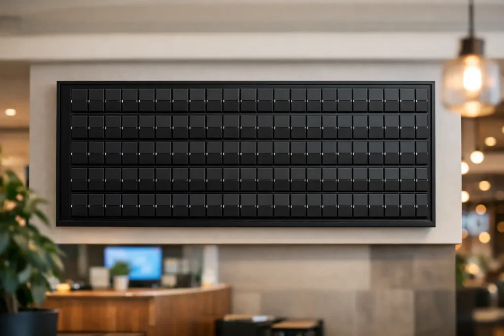
That is one reason split-flap style displays have such staying power. The format is familiar, public-facing, and naturally attention-grabbing without feeling aggressive. The click-clack rhythm, the mechanical feel, the structured rows of information – all of it gives updates a sense of occasion. Guests notice a changing message because it feels like part performance, part utility.
For restaurants that care about design, this kind of display hits a rare balance. It feels nostalgic, but not stuck in the past. It feels premium, but not fussy. And because the content is digital behind the scenes, operators can change what is shown without replacing signs all day.
Where signage makes the biggest operational impact
Some signs carry more weight than others. If you are trying to improve service flow, start with the moments where guests hesitate.
Entry signage matters because it sets expectations before a single interaction. If guests need to wait to be seated, order at the counter, scan a QR code, or check in for pickup, say it immediately and clearly. The fewer micro-decisions they have to make on arrival, the smoother the room feels.
Menu-adjacent signage is another high-value area. Daily specials, items that sold out, limited pours, kitchen timing, and service windows all change faster than permanent menus can keep up. This is exactly where flexible, updateable signage earns its place. Staff should not have to rewrite the same board three times in one shift.
Pickup and takeout zones deserve more attention than they usually get. These areas often become clutter magnets, especially during busy periods. A clean display showing order flow, pickup instructions, or status cues can reduce confusion fast.
Then there are the repeat questions. Wi-Fi, bathroom access, happy hour end times, patio status, private event notices, and allergy reminders may seem small, but together they consume staff attention. When signage answers those questions in a polished way, your team gets time back.
Design matters, but restraint matters more
There is a temptation to make signage do everything at once. Operators want to promote specials, upsell drinks, announce events, explain policies, and reinforce the brand – all in the same footprint. Usually that creates clutter.
Better restaurant signage edits hard. One sign should do one main job. If a display rotates messages, each frame should still be easy to understand in a glance. Guests are not reading a brochure. They are making decisions while standing, waiting, carrying bags, or talking to someone else.
This is where the split-flap aesthetic has an advantage. Its limitations are part of its elegance. Short lines, structured layouts, and text-led communication force clarity. Instead of trying to say everything, it highlights the right thing at the right moment.
There is a trade-off, of course. If your concept relies heavily on food photography or highly visual promotions, a text-first format will not replace every screen. It is not supposed to. It works best where clarity, rhythm, and atmosphere matter more than image-heavy selling.
Why update speed changes the guest experience
Most signage problems are not really design problems. They are update problems.
A sign may start out clean and on-brand, but if it is hard to change, it becomes inaccurate or messy. That is when guests see crossed-out items, old hours, expired offers, or taped corrections. Every one of those details subtly signals friction.
Fast updates change that dynamic. If you can adjust a message from an app, schedule content ahead of time, or switch a display between breakfast and dinner without touching the screen, signage starts supporting operations instead of lagging behind them.
That matters during real service, not just in theory. A bartender can post a sold-out note without grabbing a marker. A cafe manager can switch from morning pastries to lunch combos right on time. A host can update a private event message before guests arrive. Those are small actions, but they create a cleaner, calmer experience.
For restaurants juggling brand standards across multiple locations, centralized control becomes even more useful. You keep the room consistent while still allowing local updates where needed.
Choosing signage that fits your space
The right signage depends on your service style, pace, and aesthetic expectations. A fast-casual counter has different needs than a cocktail bar. A boutique hotel restaurant may need signage that blends into a more atmospheric environment, while a busy lunch concept may prioritize queue flow and menu clarity.
Still, the same test applies everywhere: does the sign make service smoother and the space stronger at the same time?
If the answer is no, it is probably the wrong format. A sign should not feel like an apology for changing information. It should feel like part of the brand system.
That is why many operators are moving away from disposable fixes and toward signage they can actually live with. A well-designed split-flap style display gives them both sides of the equation – retro charm, modern control. It replaces handwritten clutter with something guests notice for the right reasons. Split Flap TV is built for exactly that kind of use: text-led, app-managed, easy to update, and elegant enough to hold its own in a well-designed room.
Restaurant signage works best when it earns attention quietly. Not by shouting over the space, but by making the space feel more resolved, more informed, and more memorable with every click-clack update.