12 Office Reception Message Screen Ideas That Work
July 27, 2026 · Captain
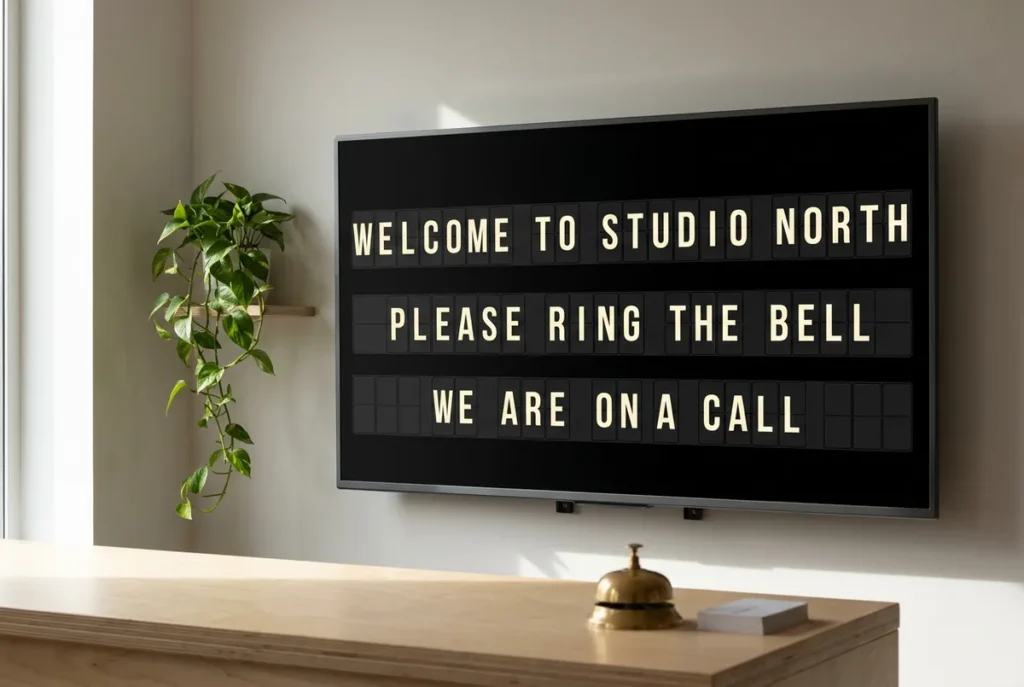
A visitor standing at your front desk should not have to hunt for a taped note, interrupt a busy employee, or guess where to go next. The best office reception message screen ideas turn that uncertain moment into a polished arrival: clear instructions, a warm welcome, and a little theater from the familiar click-clack of a split-flap board.
A reception screen is not meant to behave like a giant advertisement. Its real job is to communicate short, useful information at exactly the point someone needs it. That is where a retro split-flap format earns its place. The movement naturally catches the eye, while text-first layouts keep the message readable from across the lobby.
Start with the visitor journey
Before choosing messages, map the first two minutes of a visitor’s experience. What do they need to know when they enter? Where should they check in? Who should they contact? What changes throughout the day?
A strong reception screen answers one question at a time. Avoid trying to fill every row with company announcements, brand slogans, and tiny details. The screen has more impact when it feels like a well-run departure board: timely, deliberate, and easy to scan.
Office reception message screen ideas for better arrivals
1. A welcome message that feels personal
“WELCOME TO NORTHLINE STUDIO” is simple, but it immediately confirms that a guest is in the right place. Add a second line such as “PLEASE CHECK IN AT RECEPTION” or “YOUR HOST HAS BEEN NOTIFIED” if that reflects your process.
For client meetings, scheduled messages can make the arrival more considered: “WELCOME, RIVERVIEW TEAM.” Use this selectively. It is memorable for an important visit, but a constantly rotating list of names can feel cluttered in a high-traffic office.
2. Clear check-in instructions
Reception teams are often asked the same question all day: “How do I check in?” Put the answer on the board before anyone has to ask.
Keep the wording direct: “CHECK IN WITH RECEPTION,” “SCAN QR CODE AT DESK,” or “SIGN IN ON TABLET.” If your desk is occasionally unattended, this is one of the most valuable messages you can run. Pair it with a practical next step, such as “NEED HELP? CALL EXT. 101.”
3. A host contact prompt
In a boutique office, creative studio, coworking space, or private showroom, visitors may arrive before their host reaches the lobby. A screen can prevent that awkward wait with a message like “MEETING SOMEONE? TEXT YOUR HOST ON ARRIVAL.”
If there is a shared reception number or internal extension, display it in large characters. This works better than a paper sign because the contact details can be changed instantly when teams move, numbers change, or a temporary host takes over.
4. Directional messages for a larger space
Not every reception desk sits directly beside the meeting rooms. If guests must take an elevator, walk through a corridor, or use a specific entrance, clear directions belong on the screen.
Try concise lines such as “CLIENT SUITES: FLOOR 4,” “ELEVATORS TO YOUR LEFT,” or “DELIVERIES: USE REAR ENTRANCE.” A split-flap layout is especially effective here because it feels like wayfinding rather than an intrusive promotional display.
5. Meeting room status
A front-desk screen can show which rooms are occupied, available, or next in use. This is particularly useful when clients arrive for a presentation and need reassurance that they are expected.
For example: “10:00 AM / ATLAS ROOM / RIVERVIEW MEETING.” Keep room names and times consistent so employees can read the board at a glance. If your schedule changes frequently, cloud-managed updates save the front desk from rewriting a whiteboard between appointments.
6. Visitor Wi-Fi details
Wi-Fi is one of the most requested pieces of office information, yet it is often hidden in a framed card, shared verbally, or printed on a paper tent. A scheduled reception message puts it where guests can actually use it.
Display “GUEST WIFI: STUDIO_GUEST” followed by the password on a separate page if discretion is a concern. You might show it every few minutes rather than leave it up all day. The right choice depends on your security policy and how often clients wait in the lobby.
7. Hours and access information
A reception display can communicate your normal operating hours, but it becomes even more useful when those hours change. Holiday closures, late openings, early departures, and private events are easy to miss on a static sign.
Messages such as “OFFICE CLOSES AT 3 PM FRIDAY” or “LOBBY ACCESS BY APPOINTMENT TODAY” reduce confusion before it reaches the reception team. Schedule these notices in advance, then let them disappear automatically when they no longer apply.
8. A thoughtful waiting message
Waiting does not have to feel like being forgotten. If guests regularly spend a few minutes in reception, run a short, human message: “MAKE YOURSELF COMFORTABLE. YOUR HOST WILL BE WITH YOU SHORTLY.”
This is also a natural place for a light brand detail, such as “COFFEE IS ON US” or “PLEASE HELP YOURSELF TO WATER.” Keep the tone aligned with your space. A law office may prefer calm and formal language, while a design agency can be more playful.
9. Delivery and vendor instructions
Delivery drivers and service vendors need different information than clients. A rotating screen page can direct them without placing a permanent, unattractive sign on the counter.
Use messages like “DELIVERIES: ASK FOR OPERATIONS,” “CATERING DROP-OFF: CONFERENCE LEVEL,” or “VENDORS MUST SIGN IN.” If deliveries happen mostly in the morning, schedule those instructions for that window and free the screen for visitor messaging later.
10. Safety and building notices
When an elevator is out, a fire drill is planned, or a weather event affects access, reception is where questions pile up first. A screen gives you a fast way to establish a calm, consistent message.
“FIRE DRILL AT 2 PM. PLEASE FOLLOW STAFF DIRECTIONS” is clearer than a hurriedly printed notice. For urgent situations, prioritize plain language over clever copy. The retro charm of the display should support the message, not soften something that requires immediate action.
11. Culture moments that do not waste the screen
A reception display can show company culture without becoming a stream of vague motivational quotes. Use it for real moments: a volunteer day, an employee milestone, a team off-site, or a seasonal welcome.
“TEAM SERVICE DAY / FRONT DESK CLOSED 1-4 PM” has purpose. “HAPPY ANNIVERSARY, JORDAN” can make the office feel warm. The test is simple: would a visitor or employee find this useful, delightful, or both? If not, save the space.
12. A quiet brand signature
The final screen page can simply reinforce the atmosphere of your office. Your company name, a short line of positioning, or a simple “WELCOME” is enough. Think of it as the visual equivalent of a well-designed lobby scent or a good piece of furniture: present, intentional, and not demanding attention.
This is where a split-flap screen stands apart from a generic digital display. Its rhythmic motion and typographic character create a public-display moment that feels considered, even when the content is only a few words long.
How to keep reception messages readable
The temptation is to publish everything the office wants to say. Resist it. Reception messages work best when they use short phrases, familiar words, and enough empty space for the eye to land. If a visitor needs to stand still and read a paragraph, the message belongs in an email, visitor guide, or printed handout.
Give each page one purpose. A welcome page should welcome. A Wi-Fi page should show the network details. A wayfinding page should point people in the right direction. A rotating sequence is useful, but it should be brief enough that a visitor does not have to wait through five irrelevant pages for the one they need.
Timing matters too. Let practical messages stay on screen longer than decorative ones. A quick brand page can flip by in a few seconds; an access instruction should remain visible long enough for someone carrying a bag, looking up, and reading from several feet away.
Build a schedule, not a slideshow
The most effective reception screens change with the rhythm of the workplace. Morning pages might show check-in and delivery instructions. Midday pages can highlight meeting rooms, guest Wi-Fi, and visitor directions. Late afternoon may call for closing hours or next-day notices.
With Split Flap TV, those pages can be managed from an app rather than rebuilt at the desk. That practical control is the point: the old-school board aesthetic delivers the charm, while modern scheduling keeps the information accurate when the office gets busy.
Start with three messages your reception team repeats most often this week. Put those on screen first, watch where visitors still hesitate, and refine from there. A great reception display is not louder than the lobby. It simply makes the next step obvious.