FIDS: Flight Information Display Systems
May 24, 2026 · Captain
Airports trained the public to trust a screen. One glance, and you know whether to hurry, wait, change direction, or ask for help. That is the core job of FIDS: Flight Information Display Systems. They are not just monitors with departure times. They are high-stakes communication tools built to reduce confusion, move crowds, and keep constantly changing information readable in a stressful environment.
For anyone who works with public-facing signage, FIDS are worth understanding because they solved a problem that restaurants, hotels, offices, and retail spaces still face every day: how do you present changing information clearly, fast, and at scale without creating visual chaos?
What FIDS: Flight Information Display Systems actually do
At the simplest level, a FIDS platform shows real-time flight data such as departures, arrivals, delays, gate changes, and baggage claim assignments. But the real system is bigger than the display itself. Behind the visible board is a chain of software, data feeds, rules, formatting logic, and operational control.
A functioning FIDS pulls information from airline, airport, and operational databases, then turns that raw data into something passengers can scan in seconds. Time, destination, airline, flight number, status, and location all have to be displayed in a way that works for tired travelers, first-time flyers, international visitors, and people moving fast.
That sounds straightforward until the data starts changing every minute. Gates move. flights delay. Codeshare listings multiply. Staff need overrides. The system has to stay current without becoming cluttered or unreadable.
That is why good FIDS design is not only about technology. It is about hierarchy, restraint, and trust.
Why airports rely on them so heavily
Airports are full of competing stimuli – announcements, retail signage, security instructions, wayfinding, and crowds. In that environment, a passenger should not have to decode a screen. A FIDS board has to answer the question immediately: what do I need to know right now?
That pressure created some of the most disciplined public-information design in the world. The best systems use simple grids, consistent typography, strong contrast, and status language that can be understood at a glance. They do not try to entertain. They do not overload the viewer. They prioritize clarity because every extra second of hesitation creates friction in the terminal.
There is also an operational reason airports depend on them. Staff cannot personally inform every traveler of every update. A centralized display system scales communication across a huge facility. When information changes, the screen becomes the fastest way to rebroadcast it to thousands of people at once.
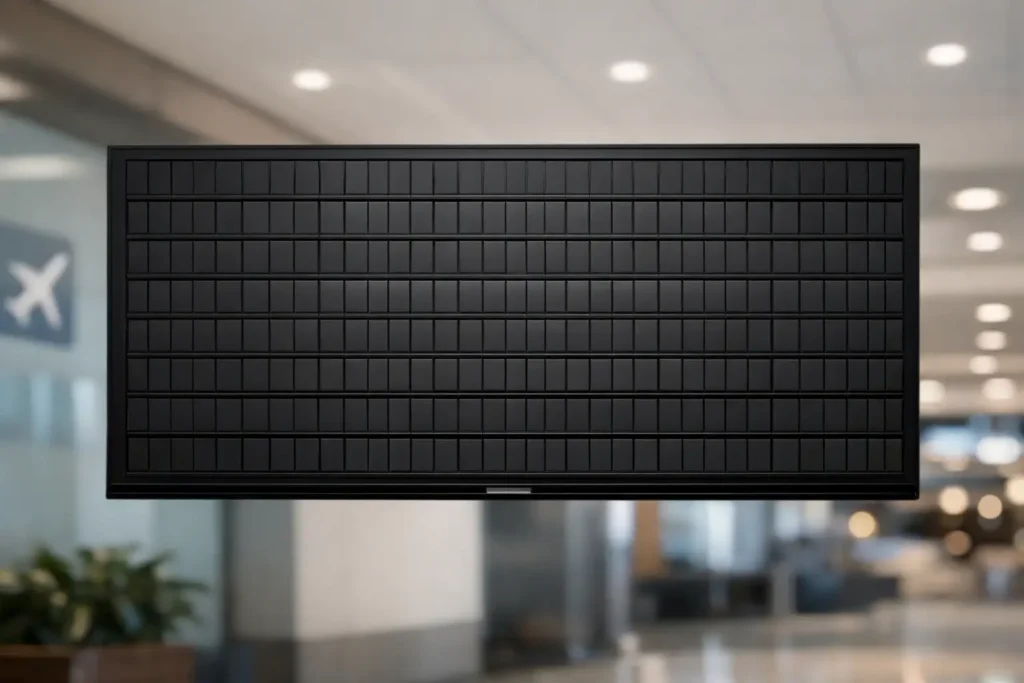
The classic split-flap connection
Before flat panels took over, many airports used mechanical split-flap boards. Those displays became iconic for a reason. They were text-first, highly legible, and impossible to ignore. The flipping motion and click-clack sound gave each update a sense of event.
That physical theater mattered more than people sometimes admit. Public displays are not just containers for information. They compete for attention. The old split-flap format succeeded because it was readable and because it created a shared moment. When a board changed, people looked up.
Modern FIDS systems are now mostly digital, but the visual discipline of those older boards still holds up. Text-led layouts, strict alignment, limited color use, and clear status updates remain effective because they respect how people actually scan information in busy spaces.
That is part of why the split-flap look still resonates beyond airports. It turns information into a focal point rather than wallpaper.
How a modern FIDS system works
Most contemporary FIDS setups are software-driven and network-connected. They collect operational data, apply business rules, and publish formatted outputs to screens across the airport. Those outputs may differ by location. A landside arrivals screen, a gate-area departure board, and a baggage claim display all serve different needs, even when they draw from the same data source.
There is usually a content management layer involved too. Airports may need to add service messages, multilingual instructions, emergency notices, or temporary operational changes. That means FIDS often lives at the intersection of automation and manual control.
The tricky part is governance. If everything is automated, errors can spread fast. If everything requires manual editing, updates become slow and inconsistent. Good systems balance both. They automate the routine while allowing staff to intervene when exceptions happen.
This is where many public display projects outside aviation go wrong. They copy the screen, but not the discipline behind it. A board that looks official but is rarely updated loses credibility fast.
What makes a FIDS display effective
The strongest FIDS boards all share the same basic qualities. They are easy to read from a distance, organized around the viewer’s immediate question, and updated often enough that people trust them.
Readability starts with restraint. Too many colors, icons, font weights, or moving elements make the board slower to scan. Airports learned long ago that information density is not the same as information clarity. A well-designed board can show a lot, but only if each element has a predictable place.
Consistency matters just as much. If delayed flights appear in yellow on one screen and red on another, or if gate information shifts position from board to board, users have to relearn the interface every time. That is a problem in any fast-moving environment.
Then there is timing. Information must feel live. Even a beautiful screen becomes useless if viewers suspect the content is stale. Public trust is fragile. Once people stop believing the board, they go back to asking staff or checking phones.
Where FIDS fail
When FIDS fail, they usually fail in familiar ways. The data source is late. The layout is overloaded. Status labels are vague. Manual overrides are inconsistent. Different screens show conflicting information.
There is also a more subtle failure: the system reflects the needs of the operator but not the viewer. For example, an internal code may mean something to airport staff but nothing to passengers. A technical abbreviation might save space but create confusion. Good public display design translates operational complexity into plain language.
Another issue is visual over-modernization. Many newer digital display systems can do far more than old boards ever could, which tempts teams to add animation, branding blocks, promos, and competing content zones. Sometimes that is appropriate. Often it weakens the display’s primary job.
A FIDS board should not behave like an ad screen. Its value comes from calm authority.
Why this matters beyond airports
Most businesses do not need flight data, but many need the same communication logic. A boutique hotel may need to show event schedules, breakfast hours, and room-ready updates. A restaurant may need rotating specials, waitlist status, pickup information, or private event notices. An office may need visitor directions, meeting room schedules, or internal announcements.
In all of those cases, the challenge is similar: present changing text-based information in a way that feels polished, accurate, and easy to absorb.
That is where the legacy of FIDS becomes useful. It proves that public-facing information does not need to be loud to be effective. It needs structure. It needs rhythm. It needs a design language that tells people, this is current, this matters, and you can trust it.
For brands that want something more distinctive than a generic digital display, the split-flap format adds another layer. It gives functional messaging a sense of presence. The retro click-clack feeling is memorable, but the real business value is practical: updates are faster, signage stays consistent, and staff spend less time rewriting the same information by hand.
That is one reason businesses still gravitate toward split-flap-inspired displays today. They borrow the authority of old transport boards while fitting modern workflows like app-based updates, scheduling, and centralized content control. Split Flap TV sits squarely in that space, reviving the visual charm without the maintenance burden of mechanical hardware.
The design lesson FIDS still teach
The biggest lesson from FIDS: Flight Information Display Systems is not technical. It is editorial. Good public information design starts with deciding what deserves to be shown, what can be removed, and how quickly someone can understand the result.
That sounds basic, but it is rare. Too many screens try to say everything at once. The result is visual noise, not communication.
FIDS earned their place because they made changing information feel dependable. They turned complexity into order. And they did it with a format that people still remember decades later.
If you manage a customer-facing space, that is the part worth borrowing. Not necessarily the airport itself, but the discipline behind the board: clear text, strong hierarchy, easy updates, and a display people actually notice when it changes.