
Best Text Displays for Coffee Shops
May 26, 2026 · Captain
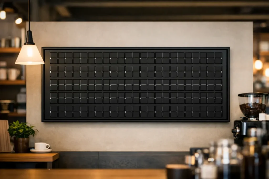
The line is five people deep, someone is asking for the Wi-Fi password, the oat milk upcharge changed this morning, and your handwritten sign still says yesterday’s pastry special. That is exactly why the best text displays for coffee shops are not just decorative – they keep service moving, reduce repeat questions, and make the whole space feel more intentional.
For coffee shops, text-first displays often work better than flashy, image-heavy screens. Most of the information customers need is simple: drink names, prices, pickup instructions, house rules, seasonal specials, hours, and quick updates. If that information is hard to read, poorly placed, or annoying to update, the display is not helping. It is adding friction.
What makes the best text displays for coffee shops?
A good coffee shop display does two jobs at once. First, it communicates quickly. Second, it supports the atmosphere you worked hard to build. Those two goals do not always point to the same solution, which is why choosing a display deserves more thought than grabbing the nearest TV and calling it a menu board.
The best setups are readable from a distance, easy to update during a busy shift, and visually aligned with the room. In a café, that matters more than people admit. A beautiful interior loses some of its charm when the counter is crowded with taped notices, smudged chalkboards, and printed sheets in mismatched holders.
There is also a practical layer. Coffee shop information changes constantly. You run out of a roast. You add a weekend special. The kitchen closes early. A staff member needs to post a pickup note for mobile orders. Static signage tends to fall behind real life. Text displays that can be updated instantly are simply better matched to how cafés actually operate.
Why text-first displays outperform generic screens
Many digital screens are built to be visually loud. That can work in some retail settings, but coffee shops usually benefit from more restraint. Guests are scanning, deciding, and ordering in a matter of seconds. They do not need a slideshow. They need clarity.
Text-first displays are effective because they reduce the message to what matters most. When the typography is strong and the layout is disciplined, customers can read the board without effort. That lowers hesitation at the register and helps new guests feel more confident ordering.
There is a branding advantage too. A text-based display can feel premium when it is designed with intention. The right board does not look like a generic office monitor hanging in a café. It looks like part of the environment.
That is where split-flap style displays stand apart. They are not trying to mimic modern ad screens packed with graphics. They revive a classic public-display format built around motion, rhythm, and text. The result is quieter than conventional digital signage, but often more memorable. The click-clack character and structured layout catch attention without shouting.
The main types of text displays coffee shops use
The old standby is still the chalkboard. It has warmth, personality, and a handmade feel that suits many independent cafés. But it comes with trade-offs. It takes time to maintain, writing quality varies by staff member, and frequent changes can leave the board looking messy. If your menu changes often, chalk can become a daily burden.
Printed signs are another common option. They are neat at first and useful for temporary messages, but they multiply fast. Before long, the front counter starts collecting taped notes about restrooms, Wi-Fi, pour-over delays, and rewards programs. Customers stop seeing them because there are too many.
Standard digital screens solve the update problem but introduce a different one. Many feel too bright, too corporate, or too generic for a carefully designed café. They can also tempt owners to overfill the screen with motion graphics and promotional clutter. More content does not always mean better communication.
Split-flap inspired text displays sit in a more interesting middle ground. They preserve the charm of old transit and timetable boards while giving you modern control over content. Instead of handwriting every change or reprinting small notices, you can publish updates through an app and keep the visual language consistent. That blend of nostalgia and practicality is unusually well suited to coffee shops.
Best text displays for coffee shops by use case
The best choice depends on what you need the display to do.
If your biggest issue is menu clarity, you want a display with clean alignment, strong contrast, and enough flexibility to separate categories like espresso, tea, pastries, and add-ons. A structured text layout works well here because customers can scan it quickly. You do not need dramatic visuals. You need hierarchy.
If the problem is constant operational updates, then manageability matters more than anything else. Can you change a line in seconds? Can you schedule different messages for morning and afternoon? Can you switch from breakfast pastries to late-day desserts without redesigning the whole board? A display that looks great but requires too much effort will be ignored by week three.
If your coffee shop leans heavily on atmosphere, aesthetics carry more weight. In that case, a retro-inspired text display can do more than inform. It becomes part of the experience. The board itself feels like a design decision, not an appliance. That distinction matters in cafés where customers linger, take photos, and remember how the room made them feel.
If you need a display near the register for short rotating messages, a compact text board is often enough. Think tips, pickup instructions, Wi-Fi details, loyalty prompts, or a seasonal note. This is where text displays earn their keep. They replace the pileup of mini signs that quietly cheapen the counter area.
What to look for before you choose
Readability comes first. A display can be beautiful and still fail if customers cannot absorb the message at a glance. Look at letter spacing, line length, contrast, and viewing distance. Coffee shops are often busy, reflective, and full of visual distractions. The board needs to hold its own.
Ease of updates is just as important. If changing content requires too many steps, it will not happen consistently. The best systems let you manage messaging without technical fuss. That is especially important for small teams where the owner, manager, or shift lead may all need to make quick changes.
Customization matters, but only if it serves a real need. You want control over layout, timing, pages, and styling so the display fits your space. At the same time, too much freedom can create chaos. A good text display system gives you flexibility while preserving a clean visual structure.
Sound is another choice worth thinking through. The split-flap click-clack effect is part of the charm, but whether you use it depends on your environment. In some cafés, that brief mechanical rhythm adds theater. In quieter spaces, you may prefer the visual motion without sound. It depends on your brand and the mood of the room.
Why split-flap style works so well in cafés
Coffee shops are full of small rituals. Grinding beans, steaming milk, calling names, stacking pastries at open. A split-flap style display fits naturally into that world because it has its own rhythm. It feels tactile even when it is digital.
That is a big reason these displays draw attention. Not because they are louder, but because they feel alive in a specific, familiar way. People recognize the visual language from stations, airports, old public boards, and classic interiors. It carries history. In a café, that history translates into atmosphere.
But nostalgia alone is not enough. It has to earn its place operationally. A modern split-flap text display does that by giving coffee shops immediate control over changing messages while preserving a refined look. You get the charm of an old board without the maintenance burden of mechanical hardware.
For shops that care about design, that combination is unusually compelling. You are not choosing between beauty and utility. You are choosing a format that delivers both.
A smarter standard than handwritten clutter
The best text displays for coffee shops make information easier to see and the space easier to run. They reduce repetitive questions, keep messaging accurate, and replace the visual noise that builds up around a busy counter. More than that, they let a café communicate in a way that matches its brand.
A polished board says something before a customer reads a single word. It tells them this place pays attention. It tells them details matter. And in a business where experience is part of the product, that kind of clarity goes a long way.