Digital Signage Onboarding Checklist
June 7, 2026 · Captain
The first day with a new display usually goes one of two ways. Either it goes live in an afternoon and starts answering customer questions right away, or it sits in a back room while someone hunts for Wi-Fi passwords, rewrites content, and wonders why the screen still feels unfinished. A solid digital signage onboarding checklist is what separates those two outcomes.
For restaurants, boutiques, hotels, and offices, onboarding is not just a technical step. It is the moment your signage system becomes part of daily operations. Done well, it replaces paper signs, reduces repeated questions, and adds a polished visual rhythm to the space. Done poorly, it becomes one more thing the team avoids touching.
What a digital signage onboarding checklist should actually cover
Most onboarding checklists focus too heavily on hardware and not enough on usage. Yes, the screen needs power, internet, and a proper mount. But the real work is deciding what the display should do for your business at 9 a.m., during lunch rush, on weekends, and when something changes five minutes before open.
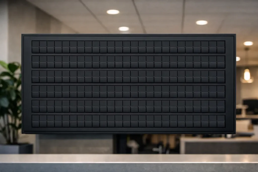
That matters even more with split-flap style signage. This format is not built to imitate flashy modern ad screens filled with motion graphics. Its strength is clarity, character, and presence. Text-led content, timed well, can feel premium and memorable in a way generic screens rarely do. The click-clack effect gets attention, but what keeps the display useful is disciplined setup.
A practical onboarding process should cover five areas: placement, connectivity, layout decisions, content planning, and ownership. Miss one of those, and even a beautiful display can turn into a neglected one.
Start with placement before you start with content
Where the screen lives will shape everything else. If your display is meant to answer common customer questions, it needs to be visible before a guest reaches the register or front desk. If it is meant to set mood and reinforce brand identity, it should sit where people naturally pause and look.
Sightlines matter more than teams expect. A display mounted too high becomes background. A display tucked beside busy shelving competes with visual clutter. A split-flap style board works best when it has room to breathe. Its charm comes from contrast, timing, and legibility, not visual overload.
You should also think about sound early. Some businesses love the theatrical click-clack because it adds nostalgia and movement to the room. Others prefer a quieter setup, especially in calmer hospitality spaces or smaller offices. Neither choice is wrong. It depends on whether the sound supports the atmosphere or interrupts it.
Placement questions to answer first
Before installation, confirm who should see the display, from what distance, and at what point in their visit. That will influence screen size, orientation, text length, and page timing. A menu board viewed from a line has different needs than a lobby message board viewed from seating.
Set up the boring operational details early
This is the part people rush, then regret. Onboarding gets easier when the basics are handled before anyone starts designing messages.
Make sure you have stable Wi-Fi credentials, the right power access, and a clear plan for mounting or standing the screen securely. Decide which team member will own the app login and whether backup access is needed for managers. If your business runs multiple shifts, avoid tying the system to one persons personal account or phone.
It also helps to choose a naming convention for displays from the beginning. If you have more than one screen, naming them by location or function saves confusion later. “Front counter menu” is better than “Screen 2.” Small decisions like this keep the system clean as you grow.
Build your layout around attention span, not screen space
A common onboarding mistake is trying to say everything at once. On split-flap style displays, restraint usually wins. Shorter messages land faster. Cleaner layouts feel more elegant. And when content changes are frequent, simple structures are easier to maintain.
This is where a digital signage onboarding checklist should push you to define purpose by screen, not just by brand. Ask whether the display is meant to show menu items, hours, events, directions, internal reminders, or rotating announcements. A screen that tries to do all of that at once usually ends up doing none of it well.
For most businesses, the best starting point is one clear primary use case with one secondary use case. A cafe might lead with daily menu highlights and rotate in Wi-Fi info or store hours. A boutique hotel might lead with welcome messaging and switch to event notices in the evening. An office might use the display for visitor information first and team communications second.
Keep the first layout simple enough to edit quickly
Your first live layout should not be your most ambitious one. It should be the one your team can update confidently in under two minutes. That means using a manageable number of rows, clear page sequencing, and language that fits naturally within the format.
The best displays feel composed, not crammed. Think less like a slideshow and more like a well-designed public board.
Prepare content before launch day
The screen should not go up before the words are ready. Waiting until installation day to write messages leads to filler copy, inconsistent tone, and rushed formatting.
Prepare a starter set of content in advance. That usually includes evergreen information like hours, house rules, Wi-Fi details, directional messaging, and a welcome line that reflects the brand. Then add flexible content that changes weekly or daily, such as specials, events, room notices, internal updates, or seasonal prompts.
This is also the right time to decide voice. If your brand is playful, keep that energy consistent. If your space is more refined, the messages should feel crisp and intentional. Split-flap displays have a strong personality, so mismatched content stands out fast.
One useful rule is to write for scanning, not reading. People will glance first, then decide whether to keep looking. Short phrases, familiar wording, and clear sequencing help the board work in real life, where customers are moving, ordering, waiting, and multitasking.
Test scheduling like it is part of the design
Scheduling is not an advanced feature. It is part of onboarding.
A display that shows breakfast items after 11 a.m. or yesterdays event notice during check-in makes the whole system feel less polished. Even a beautiful board loses credibility when timing is off. Set schedules early for dayparts, weekday versus weekend changes, and one-time events. Then test those transitions before the display becomes customer-facing.
This is especially useful for businesses with predictable operational rhythms. Restaurants can shift from breakfast to lunch automatically. Hotels can move from welcome messaging to evening event notices. Offices can rotate guest directions during business hours and internal reminders later in the day.
If your content changes constantly and manually, onboarding should include deciding what not to automate. Some screens benefit from tight schedules. Others work better with a manager making quick updates as needed. It depends on how often the information truly changes and who is available to manage it.
Assign ownership so the display stays alive
A sign that nobody owns becomes decoration.
Every digital display needs one primary owner and at least one backup. The primary owner does not need AV expertise. They just need enough authority and consistency to keep content current. In many businesses, that is a general manager, office manager, marketing lead, or shift supervisor.
During onboarding, define who updates content, who approves changes, and how often the screen gets reviewed. A five-minute weekly check is often enough to catch outdated pages, typos, or timing issues. Without that habit, even great signage starts to drift.
This is where plug-and-play matters. The easier the system is to update, the more likely it is to stay useful. Split Flap TV works well for teams that want the visual drama of classic transit-style boards without turning signage management into a side job.
A smarter digital signage onboarding checklist for everyday use
If you want the rollout to feel smooth, the checklist should be short enough to use and strong enough to prevent obvious mistakes. Confirm the display location and viewing distance. Set power, Wi-Fi, and account access. Name the screen clearly. Choose one primary use case. Build a simple first layout. Write launch content before installation. Test scheduling. Assign an owner. Then review the live screen after a normal business day, not just right after setup.
That last step matters. A display can look perfect during installation and reveal problems only once customers interact with the space. Maybe the pacing is too slow for a lunch line. Maybe the wording is too formal for the brand. Maybe the screen needs to move six inches to avoid glare. Onboarding is not finished when the screen turns on. It is finished when the display starts doing useful work.
A good sign should look like it belongs there. It should answer questions before they are asked, sharpen the atmosphere of the room, and make updates feel easier than printing another taped notice. If your onboarding process gets you to that point quickly, the screen will not feel like new tech. It will feel like something your space was missing.