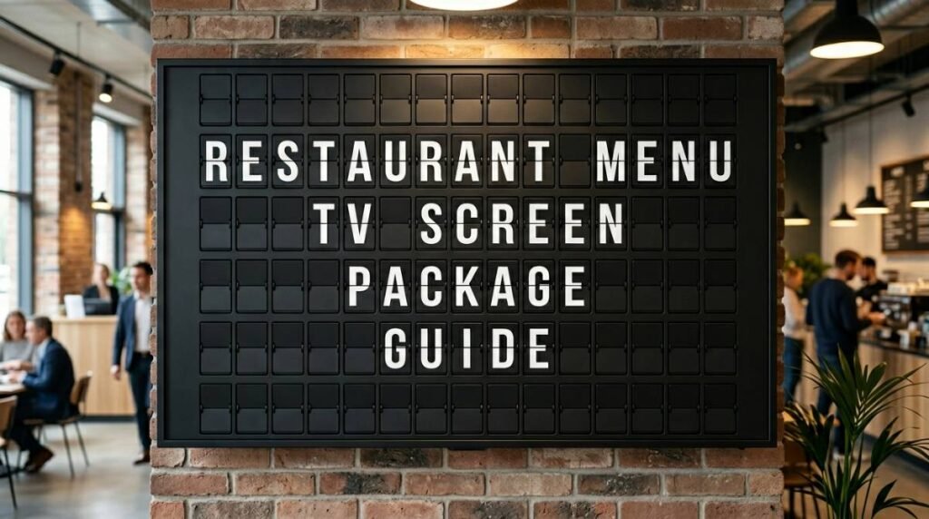
Restaurant Menu TV Screen Package Guide
March 23, 2026 · Captain
The lunch rush is no time to cross out prices with a marker, tape up a new special, and answer the same question ten times before 1 p.m. A well-planned restaurant menu TV screen package fixes that problem fast, but the best setup does more than swap paper for pixels. It should make your menu easier to update, easier to read, and far more memorable from the moment guests walk in.
For restaurants, bars, cafes, and food halls, menu screens are part operations tool, part brand experience. That matters. If your display feels generic, cluttered, or hard to manage, it becomes one more thing your staff has to wrestle with. If it looks polished and updates in seconds, it starts working like a silent front-of-house teammate.
What a restaurant menu TV screen package should actually include
A restaurant menu TV screen package is not just a TV on a wall. The useful version is a complete system: display hardware, software to control content, and a setup that matches the pace of service in a real hospitality environment.
That usually means a commercial-ready screen or prepared display, a content management app, templates or layout options, and remote publishing so changes can happen without touching the screen itself. If your breakfast menu ends at 10:30, your happy hour starts at 4, and your kitchen runs out of one item mid-shift, those updates should take a few taps, not a ladder and a printed replacement.
The strongest packages also account for the way people actually read menus in public. Guests are scanning from a distance, often while standing in line, chatting, or deciding quickly. Text has to be clear. Hierarchy has to be obvious. And if you run multiple dayparts or rotating specials, your system needs scheduling built in so the right content appears at the right time.
Why restaurants are moving past static menu boards
Printed menus still have their place. Table service, wine lists, and seasonal inserts can all work well on paper. But wall-mounted menu communication is a different job. It has to be visible, current, and easy to change under pressure.
Static boards break down when your menu changes often. Even small edits create friction. Staff end up reprinting, rewriting, patching over old information, or leaving outdated items visible because there is no time to fix them during service. That hurts the guest experience and can create awkward ordering moments.
A digital package solves the practical side, but there is another layer restaurants often miss: atmosphere. The screen is part of your interior. A basic, overstimulating display can feel out of sync with a thoughtful space. That is why style matters just as much as function.
The case for a split-flap style restaurant menu TV screen package
Not every restaurant wants bright, flashy digital signage. In fact, many do not. If your space is built around character, craftsmanship, or a strong design point of view, modern-looking menu boards can feel oddly disposable.
That is where split-flap style stands apart. The familiar click-clack rhythm and departure-board look carry real visual weight. People notice it because it feels public, tactile, and alive, even on a modern screen. It brings back the theater of old transit halls and grand lobbies, but with current-day control behind it.
For a restaurant, that combination is unusually useful. You get the charm of an iconic display language without the maintenance burden of mechanical boards. You can update specials, schedule menu changes, and adjust messaging instantly, all while keeping a more refined and text-led visual presence than many conventional digital displays.
This is especially effective for places where brand atmosphere matters as much as throughput: cafes with a strong identity, cocktail bars, boutique food concepts, hotel dining spaces, and restaurants that want guests to remember not just what they ate, but how the room felt.
What to look for before you buy
The right package depends on your service model. A fast-casual counter has different needs than a bar with rotating pours or a full-service restaurant that mainly wants to highlight specials and service information. Still, a few things matter almost every time.
Layout flexibility matters more than flashy features
Menu displays succeed when they are organized. You need control over rows, columns, page flow, and spacing so the screen matches your actual menu structure. If a system forces your menu into rigid templates, readability suffers fast.
A split-flap style display works best when the content is edited with restraint. Category headers, item names, short descriptors, and prices tend to shine. Endless lines of copy do not. That is not a weakness – it is often a benefit. It forces cleaner menu communication and helps guests decide faster.
Scheduling should be built in
Restaurants live on timing. Breakfast, lunch, dinner, late night, weekday specials, weekend brunch, limited-time offers – these should not rely on someone remembering to swap a file manually. Good scheduling lets the screen change with your operation, not against it.
That also reduces errors. If prices shift for happy hour or a special only runs on Tuesdays, automation keeps staff from improvising in the middle of a rush.
Remote updates save real labor
If changing the menu requires being physically in front of the screen, the system is already less useful than it should be. Remote control from an app or cloud dashboard is what turns a display into a practical business tool. Managers can make edits before opening, owners can review content off-site, and multi-location teams can keep messaging consistent.
The display should fit your space, not dominate it
Big is not always better. A small cafe may need one screen with a clean, elegant layout. A large quick-service setup may need multiple displays divided by category. The key question is sightline. Can guests read it from where ordering decisions happen?
With split-flap style visuals, scale is particularly important because the format is text-driven. You want enough room for clear characters and breathing space, not a packed board that feels cramped.
The operational upside restaurants feel right away
The most immediate benefit is speed. Menu updates happen in moments, not after a print run or a scramble for markers and tape. That sounds small until you multiply it across daily specials, item outages, seasonal changes, and service announcements.
There is also a consistency benefit. A polished screen keeps your menu presentation aligned across shifts. No uneven handwriting. No faded printouts. No awkward temporary signage next to carefully designed interiors.
Then there is guest flow. Clear menu communication reduces hesitation at the counter and cuts down on repetitive questions. If your screen can rotate between ordering information, pickup details, Wi-Fi, service hours, or a feature message, it starts carrying part of the communication load that normally lands on staff.
For restaurants with a strong brand identity, the payoff goes beyond efficiency. A distinctive display style becomes part of the room. Guests notice it. They photograph it. They remember it. In the right setting, that old-school click-clack feel does something generic screens rarely do – it creates presence.
When this kind of package is the wrong fit
It depends on your menu. If your business relies on dense photography, long ingredient descriptions, or constantly changing visual promos, a text-led split-flap approach may need a narrower role. It can still work beautifully for specials, service updates, featured items, or a pared-down main board, but it is not trying to be a glossy ad screen.
That is an important distinction. This style is less visual in the conventional digital-signage sense. It trades motion graphics and image-heavy layouts for clarity, character, and a more intentional public-display aesthetic. For many restaurants, that is exactly the point. For others, a hybrid approach may make more sense.
A smarter way to think about menu screens
The best restaurant displays do not just show information. They shape how the space feels while making service easier to run. That is why choosing a restaurant menu TV screen package should start with two questions: will my team actually use it, and does it look like it belongs in my business?
If the answer to both is yes, the screen stops being a gadget and starts becoming part of your operation. A prepared display with app-based control, flexible layouts, scheduling, and a distinctive split-flap presentation gives restaurants something rare: elegance that still works hard.
For operators who are tired of taped notices and disposable menu boards, that is the real shift. You are not just updating a screen. You are upgrading the way your restaurant communicates, one click-clack at a time. If you want that mix of retro charm and practical control, Split Flap TV makes a strong case for keeping your menu current without draining the character out of the room.