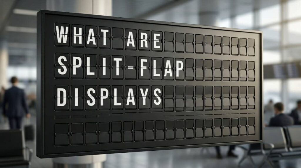
What Are Split-Flap Displays, Really?
February 22, 2026 · Captain
A customer walks in, glances up, and you can almost see the moment they decide your place feels intentional. Not because you added another neon sign or another TV menu board – but because the message is delivered with a little theater. Letters flip. The board “talks.” The room gets a tiny hit of movement and sound. That’s the split-flap effect.
What are split flap displays?
Split-flap displays are signboards made of rows and columns of characters that “flip” into place to form words, usually with that iconic click-clack motion. If you’ve ever seen an old-school train station departures board, an airport arrivals wall, or a vintage timetable in a movie, you’ve seen the split-flap language: bold characters, grid-based layout, and information that updates with a satisfying mechanical cadence.
Traditionally, each character position is a physical module with a stack of printed flaps. A motor rotates those flaps until the right letter or symbol lands on the front. Multiply that by dozens (or hundreds) of character cells, and the display becomes both a communication tool and a performance. People look up because it’s information, yes – but also because it’s motion, rhythm, and design.
Why the format still matters
Split-flap is one of the rare signage styles that feels both utilitarian and premium. The grid brings order. The limited character set forces clarity. The flipping animation draws the eye without needing bright, blinking gimmicks. In customer-facing spaces, that combination is powerful: it’s legible from across the room, it looks curated, and it turns updates into moments.
Where split-flap displays came from (and why you still recognize them)
Split-flap boards became famous because they solved a very real problem: updating public information quickly, at scale, in places where crowds needed answers. Train platforms, airline terminals, bus depots, and big lobbies all needed constant changes – gates, times, delays, arrivals. Printed signs were too slow. Handwritten boards looked messy. Early electronic signs didn’t have the warmth or readability.
So split-flap took over. It was mechanical, but it felt magical. Even now, long after LED matrices and LCD screens became cheap, the split-flap style still signals “official information lives here.” It also signals taste. That’s why boutique hotels and design-forward spaces keep bringing it back.
How a traditional mechanical split-flap display works
A classic split-flap unit is basically a tightly engineered character machine.
Each character position contains:
- A rotating drum or wheel holding a sequence of printed flaps (A, B, C… numbers, punctuation, sometimes custom symbols)
- A motor that advances the flaps
- A sensor or index point so it knows where it is in the sequence
When the system receives a new message, every character cell flips until it reaches its target. If your new line changes from “HAPPY HOUR 4-6” to “HAPPY HOUR 5-7,” only certain cells need to move – but you’ll still get that cascade of flipping across the board.
Mechanical boards are gorgeous. They’re also… mechanical. Which means they require maintenance, calibration, spare parts, and a tolerance for downtime when something misbehaves. In a transit hub, that’s a cost of doing business. In a restaurant on a Friday night, it’s a headache.
Why businesses love them: attention, trust, and vibe
Split-flap isn’t just nostalgia. It’s a specific kind of customer communication.
First, it’s an attention magnet. Movement pulls the eye naturally, and the flipping animation creates a “what’s changing?” impulse. A static sign can fade into the background in minutes. A split-flap board keeps earning glances.
Second, it conveys trust and clarity. The format is associated with schedules, departures, and real-time updates – the kind of information people rely on. When you use the same visual language for “KITCHEN CLOSES 10:00” or “TODAY’S SOUP TOMATO BASIL,” it feels authoritative instead of improvised.
Third, it upgrades the room. The grid aesthetic reads as designed. Even a simple message looks curated when it’s composed in a split-flap layout.
The trade-offs: why mechanical split-flap can be tough in real life
If you’re considering an authentic mechanical board for a customer-facing venue, the trade-offs are worth naming plainly.
Maintenance is the big one. Mechanical systems wear. Flaps can chip or fade. Motors and sensors can drift. Dust is not your friend. If you’re running a busy bar, cafe, or hotel lobby, you may not want “display mechanic” on the list of things that can break.
Then there’s flexibility. Mechanical boards usually have a fixed number of rows and columns, a fixed character width, and a fixed set of symbols. That’s part of the charm, but it can be limiting when you want to post a longer message, rotate multiple pages, or match brand colors.
Finally, content control can be clunky. A lot of classic boards weren’t designed for cloud-based scheduling, remote updates, or live feeds. If you’re managing multiple locations or you want a manager to update messaging from home, you’ll feel that gap fast.
Modern split-flap displays: the look and feel, without the mechanical burden
This is where the category has evolved. Today, you can get the split-flap aesthetic in digital form – displayed on modern screens – while keeping the recognizable flip animation, the structured grid, and (if you want it) the click-clack sound.
The idea is simple: instead of hundreds of physical character modules, a display renders the split-flap visual experience in software. That changes what’s possible.
You can update messages instantly. You can schedule content by daypart. You can switch layouts for different needs (menu now, event schedule later). You can keep everything consistent across locations. And you can do it without climbing a ladder to swap anything out.
For many businesses, that’s the sweet spot: the emotional punch of split-flap, with the operational sanity of modern digital signage.
What split-flap displays are used for in businesses today
Outside of transit, split-flap works best anywhere information changes frequently and customers keep asking the same questions.
Restaurants and bars use split-flap style boards for rotating specials, happy hour windows, event nights, or simple “ORDER HERE” direction that looks intentional instead of shouty.
Boutique hotels use them for lobby messaging: welcome notes, check-in info, breakfast hours, local recommendations, and event schedules. The format feels aligned with hospitality – polished, calm, and a little cinematic.
Retail and studios use them for class schedules, drop times, limited releases, and operational notes like “FITTING ROOMS OPEN” or “PICKUPS AT COUNTER.” The grid helps keep short messages crisp and legible.
Offices use them for visitor messaging, conference room wayfinding, and internal culture moments – the kind of thing that makes a lobby feel less generic.
What to look for if you want the split-flap effect in your space
The split-flap “wow” is surprisingly easy to lose if the execution is off. A few elements determine whether it reads as premium or like a gimmick.
Legibility comes first. The board should be readable from the distance people actually stand. That means character size, contrast, and spacing matter more than cute animations.
Customization matters next. Real venues don’t live on one message. You’ll want control over rows and columns, timing of the flip, page rotations, and ideally color themes that fit your interior.
Then think about day-to-day operations. Can you update it during a rush from a phone? Can you schedule content so your staff doesn’t have to remember it? Can you manage multiple screens without reinventing the wheel each time?
Lastly, consider sound. The click-clack is part of the emotional memory for a lot of people, but it’s not right for every environment. A loud cafe might love it. A quiet wellness studio might want the animation with the sound off.
A practical way to get the look with modern control
If your goal is the classic split-flap experience without inheriting a maintenance project, a screen-based approach can be the most business-friendly option. Split Flap TV is built specifically for that: a retro-authentic split-flap aesthetic (with optional sound) rendered on modern TVs and tablets, controlled through a subscription app for layouts, scheduling, and live content feeds. You buy a screen, download the app, and publish – no taped paper signs, no constant reprinting, and no mechanical parts to keep alive. If you want to see what that looks like in real spaces, start at https://splitflaptv.com.
The real reason split-flap keeps coming back
People don’t fall in love with signage because it’s technically correct. They fall in love with it because it makes a place feel like a place. Split-flap does that in a very particular way: it turns information into ambiance.
When your hours change, when your menu shifts, when you’re running an event, when you need to answer Wi‑Fi questions for the hundredth time – the message still matters. But how you deliver it matters too. The split-flap format says, “We thought about this,” while staying clear, direct, and easy to update.
If you’re choosing signage for a customer-facing space, aim for something that earns attention without begging for it. The best split-flap displays don’t just tell people what to do – they make them want to look up.