
Guide to Restaurant Specials Display Screens
May 30, 2026 · Captain
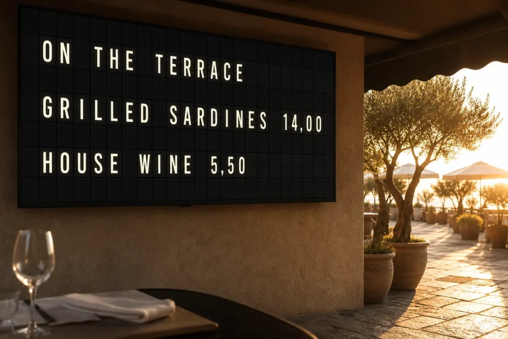
The lunch rush is not the time to erase a chalkboard, squeeze in a new soup, and hope guests notice the update. A good guide to restaurant specials display screens starts with that reality: specials change fast, staff are busy, and the sign has to do more than look nice. It has to catch attention, stay accurate, and fit the rhythm of service.
For restaurants, bars, cafes, and hotel dining spaces, specials displays sit in a tricky spot. They are operational tools, but they also shape the room. A handwritten board can feel charming until it looks rushed. A generic screen can feel too cold. The best restaurant specials display screens land in the middle – clear, memorable, and easy to update without turning the dining room into a tech showroom.
What restaurant specials display screens should actually do
A specials screen is not there to replace your full menu. Its job is narrower and more valuable. It should answer the guest’s immediate question: What should I order right now?
That means the content needs to be brief, legible, and timely. If your crab cakes are available only after 5 p.m., the screen should switch automatically. If the kitchen sells out of the braised short rib at 8:10, the message should change in minutes, not after the next lull. The screen is working best when it reduces friction for both guests and staff.
There is also a brand layer. In customer-facing spaces, signage always says something about the business before anyone reads the words. A taped printout says one thing. A polished display with movement and intention says another. For restaurants that care about atmosphere, that difference matters.
A guide to restaurant specials display screens by venue type
Not every restaurant needs the same kind of setup. A quick-service counter, a neighborhood wine bar, and a boutique hotel breakfast room all have different traffic patterns and different attention spans.
In a cafe, the screen usually needs to work from a distance. People are ordering quickly, often while scanning the pastry case and listening for their name. Here, fewer lines and bold wording tend to outperform dense descriptions. “Today only: pistachio cold foam” works better than a paragraph.
In a full-service restaurant, the specials display often plays a supporting role near the host stand, bar, or entry. Guests have a few extra seconds to look, so you can show more nuance – a seasonal cocktail, a market fish, a dessert feature, or happy hour timing. The key is restraint. The moment a specials screen starts trying to behave like a full digital menu board, it loses focus.
Bars have their own rhythm. Timing matters more than almost anything else. If happy hour begins at 4, late-night bites start at 10, and Sunday has its own rotation, scheduling becomes the real feature. The best setup lets you plan content in advance so the board changes with the room, not after someone remembers.
Why the display style matters more than many operators think
Most signage advice leans hard on bright graphics, motion effects, and image-heavy layouts. That can work in some environments, but it is not the only path. In many hospitality spaces, especially design-conscious ones, text-first display can be stronger.
A split-flap style screen is a good example. It has movement, but not the kind that overwhelms the room. It feels cinematic in a quiet way. The familiar click-clack rhythm and old transit-board character create a small moment of theater, which is exactly why people look up. And because the format is built around text, the message stays direct.
That trade-off is worth understanding. A text-led board is not trying to compete with glossy, image-rich digital signage. It is doing something else. It brings attention through motion, nostalgia, and elegance rather than through visual overload. For restaurants that want a display to feel premium and distinctive without becoming flashy, that difference is the whole point.
Placement comes before design
Operators often start with layouts and fonts when they should start with sightlines. If guests cannot see the screen at the right moment, the design will not save it.
Think about where decision-making happens. Is it in line before ordering? At the host stand while guests wait to be seated? Near the bar where people look up between rounds? Place the screen where attention naturally pauses.
Height matters too. Mount it high enough to be visible over heads and counters, but not so high that reading it feels like airport gate information. You also need to consider glare, especially in storefront cafes and daylight-heavy dining rooms. A beautifully programmed screen in direct reflection is still unreadable.
For most venues, one well-placed specials display is more effective than several competing messages. If the room already has menus, table tents, and promotional signs, adding another loud screen can clutter the experience. A single display with clear authority often performs better.
What to put on the screen
The strongest specials screens are edited. They do not show every available item. They show what deserves attention now.
A smart rotation often includes daily specials, limited items, time-based offers, and practical messages that save staff from repeating themselves. That might mean today’s soup, a seasonal cocktail, brunch hours, or a reminder that patio seating opens at 5. If your display can handle scheduled pages, you can rotate these messages without making the screen feel busy.
Keep descriptions short. Guests should understand the offer in seconds. Use names first, then one useful detail if needed. “Roasted tomato bisque” is strong. “Roasted tomato bisque with basil crema” can work. A line-by-line ingredient breakdown usually belongs elsewhere.
If you run a lot of specials, prioritize by business goal. Are you trying to move a high-margin cocktail, highlight a limited dessert, or reduce ordering confusion during a packed shift? The answer should shape what appears first.
Design rules that make screens easier to read
Good restaurant signage is usually simpler than owners expect. The temptation is to fill space because a blank area can feel wasted. On a specials screen, empty space is doing a job. It gives the eye somewhere to rest and makes the key message feel intentional.
Use short lines. Avoid crowding too many items on one page. If your platform allows multiple pages, that is often better than shrinking text to fit everything at once. Contrast matters, too. Strong light-on-dark or dark-on-light combinations are safer than subtle palettes that disappear under restaurant lighting.
Motion should be purposeful. The split-flap effect works because it signals change, then settles. It draws the eye and then gets out of the way. Constant animation, scrolling, and rapid transitions can make a specials board harder to read, not more engaging.
The real operational win is fast updates
The biggest benefit of restaurant specials display screens is not aesthetic. It is control.
When a manager can update messaging from an app instead of rewriting a board or printing inserts, the entire process tightens up. Content stays accurate. Staff stop apologizing for outdated specials. The front of house and the kitchen stay more aligned.
This matters even more when you manage multiple dayparts. Breakfast, lunch, happy hour, dinner, and late-night all have different priorities. Scheduling content ahead of time turns the display into part of the operation rather than one more task during service.
It also helps with consistency across locations. If your team runs more than one venue, centralized control keeps messaging cleaner. Everyone sees the same featured item, the same timing, and the same brand presentation. For growing hospitality groups, that is a major advantage.
What to look for in a system
A practical guide to restaurant specials display screens would be incomplete without talking about setup. Restaurants do not need another complicated platform that requires AV expertise or constant babysitting.
Look for something plug-and-play, easy to edit, and flexible enough to match the space. You want control over layouts, colors, timing, and scheduling without a steep learning curve. Being able to manage the screen remotely is especially useful when changes happen before opening or between shifts.
It also helps when the display style feels intentional on its own. That is part of why split-flap inspired systems have gained traction in hospitality settings. They turn plain text into a visual moment. In places where brand experience matters, that can be more effective than a generic screen template.
Split Flap TV leans into exactly that balance – the retro charm of a classic public display, paired with modern app-based control that makes updates quick and realistic for busy teams.
Common mistakes to avoid
The most common mistake is trying to say too much. If guests need ten seconds of concentration to understand your specials board, it is already underperforming.
The second is forgetting that content ages fast. A beautiful display with stale information becomes background decor. Someone needs ownership of updates, whether that is a manager, bartender, or marketing lead.
The third is choosing a screen style that fights the room. If your restaurant has warmth, texture, and personality, the signage should support that mood. A specials display should feel like part of the environment, not an appliance dropped into it.
Restaurant specials move quickly, but the guest impression lasts longer than most operators think. When the display is clear, timely, and full of character, it does more than announce the soup of the day. It makes the whole place feel sharper, calmer, and more considered.
A Worked Example: One Bistro Screen Through the Day
Picture a neighborhood bistro with a host stand near the entrance and a bar visible from the door. One screen sits by the entry, styled like a classic split-flap board with a dark background and warm cream text. The top line reads TODAY’S SPECIALS, and four rows sit beneath it:
- LUNCH – ROASTED TOMATO BISQUE + HALF SANDWICH
- DINNER – BRAISED SHORT RIB WITH POLENTA
- HAPPY HOUR 4-6 PM – HOUSE RED / FRIES / OYSTERS
- PATIO OPEN / WALK-INS WELCOME
That alone beats a handwritten sign: it is legible, current, and easy to change. The stronger version is scheduled. At 10:30 a.m. the lunch feature appears, at 3:45 p.m. happy hour moves to the top position, and at 6:00 p.m. the dinner special takes priority. Nobody stops service to swap signs. The last row matters too: it answers a question guests would ask anyway.
Live changes fit around that schedule. If the kitchen decides at 4:12 p.m. that a mushroom risotto will be tonight’s feature because a strong shipment came in, the manager opens the app, replaces the lunch line in the dinner layout, and publishes. If it sells out at 7:40, the line changes again, with no crossed-out board and no server racing to stop a table from ordering it. The same approach handles weather: moving patio cocktails indoors when it rains, or pushing hot cider when the temperature drops.
Specials Ideas That Work Especially Well in Bars
Bars run on timing, and a few formats consistently earn their place:
- Day-of-week rotations. Taco Tuesday, industry night, or game-day pitchers stay accurate when the board changes with the calendar, so staff never explain that the deal on the sign is actually tomorrow’s.
- Pairing messages. “House lager + pretzel special” or “Old fashioned + burger after 8” helps guests decide faster and sells the second item. Pairings work best when they sound curated.
- Limited-time lines used sparingly. “Tonight only” or “Last call for oyster happy hour at 6 PM” creates urgency when timing is genuinely part of the offer. Not every promotion should feel like a countdown.
- A bartender’s choice spotlight. A named pick, such as “Nina’s pick: spicy paloma,” gives hesitant guests an easy entry point and gives the bar a voice.
- A “what’s pouring now” board. For fast-moving tap lists, accuracy matters more than flourish, and a featured keg can be flagged before it kicks.
- Window-facing messages. Keep them bold and minimal, like “Happy Hour 4-6,” to win split-second decisions from passersby.
- An FAQ-style panel. When does happy hour end? Are martinis included? Which drafts are discounted? Answering these on screen speeds up ordering.
Many bars do best with one traffic-driving sign (entrance or window) and one ordering sign (behind the bar). High-volume happy hour venues should lead with the first; bars built on discovery and premium pours should focus on the second.
Keeping Instant Updates Disciplined
Being able to change a message at any moment also means it can drift. When a guest reads one special at the entrance, hears another from the server, and sees a third on a table card, the room feels disorganized. A little process prevents that.
Assign one person per shift with final say on live specials, whether that is the manager, bar lead, or a supervisor. The point is consistency, not hierarchy. Prepare a few ready-made layouts, such as one for food specials, one for drinks, one for sold-out notices, and one for upcoming events, so updates mean dropping in new text rather than starting from scratch.
If you run several screens, an app-based system lets you update one screen, all of them, or different zones, for example a bar promotion alongside a different dining room feature, without walking the floor. More screens also mean more content decisions, though. In a small restaurant, one well-placed display can outperform a network of screens with mixed messages.