Why the Airport Departures Board Still Works
March 15, 2026 · Captain
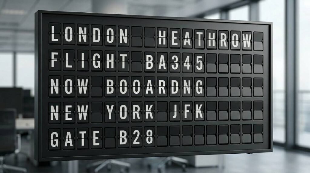
Walk through any busy terminal and you can feel it before you even read it – the airport departures board has presence. Not just because it holds useful information, but because it commands attention in a way most screens never do. Rows of changing letters, the rhythmic click-clack, the sense that something important is happening right now. It turns information into a public event.
That is exactly why this format still matters far beyond air travel. For businesses trying to communicate changing information in a polished, memorable way, the airport board is more than a nostalgic reference. It is a masterclass in clarity, hierarchy, and atmosphere.
What makes an airport departures board so effective
At its best, an airport departures board does three jobs at once. It organizes fast-changing information, helps people self-serve, and creates confidence in a high-traffic environment. People do not need training to use it. They glance, scan for their row, and move.
That ease is not accidental. The design language is brutally practical. Destination, time, gate, status. Short words. Tight structure. Strong contrast. A predictable layout that lets the eye find what matters fast.
There is also a psychological advantage. Public boards feel official. When information appears on a well-designed display, it carries more authority than the same message scribbled on paper or taped to a counter. For a restaurant posting specials, a hotel sharing check-in details, or an office managing visitor directions, that difference matters. Presentation affects trust.
And then there is the theater of it. Traditional split-flap boards were never subtle. When a line changed, everyone noticed. That movement created a shared moment in the room. Even now, the visual rhythm of a split-flap-style display cuts through background noise better than many glossy, motion-heavy screens because it feels purposeful rather than distracting.
The split-flap effect is not just nostalgia
It is easy to dismiss the airport departures board as a beautiful relic. That misses the point. Its staying power comes from the way form and function support each other.
Split-flap displays were built for legibility at a distance. They favored text over decoration. They made updates visible. And because the movement was mechanical in spirit, every change felt deliberate. You did not miss it.
That makes the split-flap effect incredibly relevant for customer-facing businesses today. Most venues do not need video walls or flashy animation for everyday communication. They need something cleaner. Something that can show hours, specials, room information, event schedules, menu changes, or announcements in a way that feels elevated rather than improvised.
A split-flap-inspired display brings back the part people loved – the iconic motion, the visual order, the click-clack personality – without the maintenance burden of old mechanical boards. That is the difference. You keep the charm, but gain modern control.
Why this format works so well outside airports
The same logic that made an airport departures board useful in a terminal makes it powerful in retail, hospitality, and workplace settings. Busy spaces create repeated questions. What are today’s specials? When does happy hour start? Where is the meeting? What is the Wi-Fi password? Are you open on holidays?
When those answers live on handwritten signs, printed sheets, or staff memory, things drift. Information gets outdated. Signs start to look temporary. Employees repeat themselves all day. Customers hesitate instead of acting.
A structured board changes that. It turns scattered messaging into a system. And because the airport-style format is familiar, people know how to read it almost instantly.
A boutique hotel might use it for arrivals, breakfast hours, neighborhood notes, or event listings. A cafe might show menu items, pickup instructions, and limited-time specials. An office lobby might rotate guest welcome messages, meeting room assignments, and internal announcements. In each case, the value is not only visual. It is operational.
Airport departures board design teaches a useful lesson
The lesson is simple – less visual clutter, more signal.
A lot of modern signage tries too hard. Too many colors. Too many moving elements. Too many competing messages on one screen. That may look advanced on a spec sheet, but in a real environment it often makes information slower to absorb.
The airport departures board succeeds because it respects the viewer’s time. It presents a lot of information, but in a disciplined way. Each row has a job. Each column has a job. The typography is doing real work.
For business owners, that is a useful design benchmark. If your signage has to communicate quickly across a room, text-first structure often beats decorative excess. The goal is not to imitate an airport literally. The goal is to borrow what airports got right – consistency, hierarchy, timing, and confidence.
The trade-off: charm alone is not enough
There is one important caveat here. Nostalgia by itself does not solve communication problems.
A beautiful board that is hard to update will become stale. A retro display with rigid layouts may look impressive for a week and then turn into wall decor. If the content cannot keep up with daily operations, staff will go back to tape, paper, and verbal explanations.
That is why the modern version matters. The smartest split-flap-style systems are not trying to recreate old hardware piece by piece. They are recreating the experience while making content easier to control. That means app-based publishing, scheduling, layout flexibility, and the ability to change messaging in seconds instead of physically flipping characters by hand.
It also means accepting that not every business needs a literal departures board format. Sometimes a single-page specials board is the better fit. Sometimes rotating announcements make more sense. Sometimes a venue wants the split-flap look without the airport metaphor. It depends on the space, the audience, and how often information changes.
How to bring the airport departures board feel into your space
The best implementations start with use case, not aesthetics alone. First decide what information changes often enough to deserve a permanent display. If your team updates it daily or answers questions about it constantly, that is usually a strong candidate.
Next, think in rows and categories. The airport model works because it creates scanning behavior. Instead of designing a poster, design a board people can read in seconds. Keep messages short. Use labels consistently. Give each line a clear role.
Then consider placement. A split-flap-style display shines in transitional spaces – behind a counter, near an entrance, in a lobby, beside a host stand, or anywhere people naturally pause and look around. It is not background wallpaper. It performs best when it is allowed to be seen.
Finally, make sure updates are easy enough for real life. During a lunch rush, before check-in, or between meetings, nobody wants to wrestle with complicated software. The setup has to be simple enough that changing a message feels routine, not technical.
That is where a platform like Split Flap TV fits naturally. It brings the visual language people love from classic public boards into modern screens and tablets, with cloud-based control, configurable layouts, scheduling, and the signature split-flap motion that still turns heads.
Why people remember this look
There is a reason the airport departures board keeps showing up in design references, films, hospitality spaces, and branded interiors. It represents motion, anticipation, and order all at once. It feels civic. Timely. Slightly dramatic in the best way.
For businesses, that emotional layer is not fluff. Memorable environments are easier to talk about, photograph, and return to. A thoughtfully used split-flap-style display can make a space feel more intentional without becoming gimmicky.
The trick is restraint. Use it for information that benefits from public visibility and frequent change. Let the typography and movement do the work. Do not overload it with every message you have.
The airport taught us something valuable years ago: when information is structured beautifully, people trust it faster and remember it longer. That is still true whether you are announcing a gate change or today’s espresso special.
If your space needs signage that feels sharper than a printed notice and more human than a generic digital screen, the old departures board still has a lot to teach.