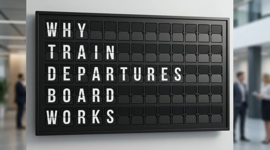
Why a Train Departures Board Still Works
March 14, 2026 · Captain
The fastest way to make people look up is not always a brighter screen. Sometimes it is the familiar click-clack rhythm of a train departures board, the kind of display that turns plain information into a public moment.
That is why this format still has such pull. A classic departures board was never just a schedule. It gave movement to information. You could hear it changing, see it settle, and trust that something current had just arrived. Even now, when nearly every venue has access to flat digital signage, the split-flap look carries a kind of authority that generic screens rarely match.
For businesses that need to communicate clearly and look polished while doing it, that matters more than nostalgia alone.
What makes a train departures board so memorable
A train departures board works because it combines order, motion, and anticipation. Rows line up. Messages update in sequence. People instinctively scan for the line that matters to them. It is one of the cleanest information systems ever put in a public space.
There is also a theatrical quality to it. When a board flips from one message to the next, it does not feel passive. It feels announced. That small burst of movement creates a pause in the room, and attention follows. In busy restaurants, hotel lobbies, offices, and retail spaces, that effect is valuable because most signage is ignored the moment it blends into the background.
The best part is that the visual language is already familiar. People understand what this kind of board is for. Even if the content is not train times, the structure tells them to expect useful, changing information. That makes it ideal for menus, specials, wayfinding, event notices, welcome messages, Wi-Fi details, and rotating announcements.
Why the train departures board aesthetic fits modern spaces
There is a reason this look has survived beyond the station. It feels designed. Black frame, crisp lettering, strong grid, purposeful motion – the whole format has discipline. It can sit comfortably in a boutique hotel, a bar with a strong interior concept, a coffee shop that cares about atmosphere, or an office reception area that wants more personality than a slideshow.
That said, style alone is not enough. A display has to earn its place operationally. If it looks great but becomes a hassle to manage, staff will stop using it well. This is where the old mechanical charm becomes far more practical when delivered through modern control.
A split-flap style digital display keeps the visual magic while removing the maintenance burden of mechanical hardware. You still get the iconic flip animation and optional sound, but updates happen through an app instead of ladders, paper inserts, taped notices, or manual letter changes. That is the real shift. The aesthetic stays timeless, while the workflow becomes current.
A departures board is really a communication system
Businesses often think about signage as decoration first and communication second. A departures-style board flips that order. It is decorative because it communicates so well.
In practical terms, that means it can solve daily friction. A cafe can rotate breakfast and lunch messaging automatically. A hotel can post check-in details, event schedules, and neighborhood tips without printing new signs every week. An office manager can keep visitors informed about room assignments, announcements, and welcome notes in a format that feels elevated instead of temporary.
The structure helps here. Because the board is text-led, messages tend to be shorter and clearer. That is a strength, not a limitation. Most customer-facing information works better when it is direct. Hours, specials, names, destinations, menu items, timing, and reminders do not need flashy graphics. They need to be readable from a distance and updated without fuss.
That is where a split-flap style board outperforms a lot of modern signage. It is not trying to do everything. It is doing one thing exceptionally well – presenting changing text in a way people actually notice.
Where a train departures board works best
Some venues benefit from this format more than others. If your messaging changes often and your space depends on atmosphere, it is a strong fit.
Restaurants and bars use it well because specials, featured items, and service notes are always in motion. Instead of handwritten chalkboards that need constant cleanup or printed signs that look dated by the end of the shift, staff can update the board remotely and keep the room looking sharp.
Boutique hotels are another natural match. Guests are already primed to notice directional and scheduling information. A departures-style board can frame that information with much more character than a standard lobby screen. It turns logistics into part of the experience.
Retail spaces can use the format to spotlight launches, store policies, pickup details, or limited-time messages without cluttering the sales floor. Offices and coworking spaces can give reception areas a stronger first impression while still handling practical announcements.
It does depend on the kind of content you need to show. If your strategy relies heavily on video, photography, or detailed diagrams, a text-first split-flap format is probably not the main display you want. But if your most important communication can be expressed in concise lines, this format is often stronger because it strips away distraction.
Why attention matters more than screen size
A large display that no one reads is just expensive furniture. A smaller board with presence can do more work.
The reason is behavioral. People filter out most visual noise in public spaces. Brightness alone does not fix that. Movement with meaning does. The flipping action of a departures board signals that something has changed right now, and that cue is enough to pull the eye.
There is also trust in the format. A board modeled after transportation signage suggests timeliness and order. That is useful when your business depends on keeping customers informed quickly. A neat, centrally managed display feels more reliable than scattered paper signs and verbal reminders.
For operators, that can reduce repeated questions. If the board clearly shows hours, promotions, event timing, or house information, staff spend less time repeating themselves and more time serving customers.
The operational case for going digital with split-flap style
This is where nostalgia needs to prove itself. If a display is only charming, it becomes a novelty. If it is charming and efficient, it becomes infrastructure.
A modern split-flap system lets you control layouts, pages, scheduling, and live content without giving up the analog feel people love. You can prepare a screen, download the app, publish updates, and manage messaging across one venue or several. That means fewer rushed reprints, fewer handwritten corrections, and fewer moments where outdated information stays visible because no one had time to fix it.
Customization matters too. Different businesses need different board behaviors. Some want a classic arrivals-and-departures rhythm. Others want rotating announcements or a menu that changes by time of day. When rows, columns, timing, and colors can be adjusted, the board becomes part of the brand instead of a generic template.
That balance is what makes the format feel premium rather than gimmicky. The look is iconic, but the control is practical.
A train departures board is old technology with a very current job
There is a common mistake businesses make when choosing signage. They assume newer visuals automatically mean better communication. Often the opposite is true. The most effective displays are the ones people understand immediately.
A train departures board has had decades to prove that it can organize attention in crowded places. That is not accidental. It was built for public clarity. Reimagined through modern screens and app-based control, it becomes a smart tool for businesses that want elegance without extra maintenance.
That is also why the format feels at home in design-conscious spaces. It does not chase trends. It carries a visual identity that already means something to people. When done well, it feels both familiar and fresh.
If your signage needs to work harder than a taped notice and look better than a generic screen, this style earns its footprint. And if you want that old station magic without the old station upkeep, Split Flap TV brings the click-clack back in a form your team can actually manage on a busy day.
The best signage does not shout for attention. It gives people the right information in a way they want to watch.