Cafe Menu Board Ideas: From Chalkboard Classics to Split-Flap Digital Signage
April 21, 2026 · Captain
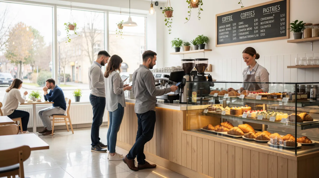
Walk into any coffee shop, and your eyes go straight to the menu board. It’s the visual centerpiece of the space, quietly shaping first impressions, dwell time, and what customers ultimately order. In 2025–2026, with rising ingredient costs and increasing competition, the right menu board isn’t just decoration—it’s a sales tool that works every hour you’re open. While the menu board is a focal point, it works in harmony with all the other elements of the store’s interior design to create a cohesive and inviting atmosphere.
Even small independent cafes can use creative, changeable menu boards to highlight seasonal coffees, pastries, and limited-time drinks. Effective cafe menu board ideas can positively impact your business by shaping customer perceptions and supporting growth. Whether you’re leaning into the warmth of handwritten menus or exploring digital menu boards with kinetic charm, there’s a considerable amount of room to differentiate your space. This article covers both analog options (chalk, pegboard, paper) and modern digital ideas (TV screens, SplitflapTV), with practical tips for layout, content, and branding. The focus is on concrete, immediately actionable ideas you can implement this month—not abstract design theory. We’ll gradually move from classic boards to more unique options like split-flap digital signage, a standout solution for modern cafes seeking something memorable.
Why Menu Boards Matter So Much in a Cafe
For most cafes, the menu board is the most carefully watched piece of signage in the entire space. Every guest who orders at the counter must look at it, often for 15–30 seconds while deciding what to get. That makes it your single most influential touchpoint for shaping purchasing decisions.
A well-structured board reduces queue time, lowers ordering friction, and keeps the line moving during the critical 8–10 a.m. morning rush. When customers can quickly scan categories, spot their usual order, and notice one or two appealing alternatives, they decide faster and feel more confident. Bars, restaurants, and cafes all benefit from this principle, but coffee shops with high morning volume feel it most acutely.
Clear menu boards can also subtly steer guests toward higher-margin items. Specialty lattes, alternative milks, and pastry add-ons all become easier to sell when they’re positioned where the eye naturally lands. For example, moving a “flat white + croissant combo” from a lower corner into a highlighted center area—with a small price advantage—can noticeably increase average ticket size without any pushy upselling from staff.
In crowded, urban cafes where customers often make decisions in under 30 seconds, readability and hierarchy matter more than decorative flourishes. Fancy script fonts and cluttered layouts may look charming in photos, but they slow down orders and frustrate both guests and baristas.
Key Ways a Menu Board Impacts Your Cafe
- Customer experience: Legible typography and logical grouping (coffee, non-coffee, food, seasonal) help guests decide quickly, especially at peak hours. When categories are clear, regulars find their order in seconds and newcomers can browse without anxiety about holding up the line.
- Sales and upselling: Where and how you place add-ons—extra shot, alternative milk, syrup, pastry—can significantly change what customers order. Visual cues like boxes, underlines, or dedicated “Make it a combo” sections encourage purchasing without requiring baristas to pitch verbally.
- Brand perception: The board’s aesthetics (minimalist, rustic, playful, high-tech) directly connect with your overall atmosphere and target audience. A chalkboard with hand-drawn illustrations signals “cozy neighborhood spot,” while a sleek digital display says “modern and efficient.” Match the board to who you’re trying to attract—students, remote workers, commuters, or specialty coffee enthusiasts.
- Operational flexibility: Cafes with regularly changing beans, guest roasters, and seasonal items benefit enormously from boards that can be updated daily without stress. If changing a price means a frustrating hour of re-lettering, you’ll put it off—and that leads to outdated information, crossed-out text, and a sloppy overall look.

Core Types of Cafe Menu Boards (Analog & Digital)
Before diving into specific board ideas, here’s a quick landscape overview of the main formats available. Each has trade-offs in cost, updatability, and the kind of cafe it suits best.
Some cafes use panels—modular or interchangeable display elements—to organize and showcase menu items. Panels allow for flexibility and easy seasonal updates, making it simple to refresh offerings or highlight specials.
|
Board Type |
Best For |
Cost Level |
Update Speed |
|---|---|---|---|
|
Chalkboard |
Neighborhood bakery-cafes, specialty shops |
Low–Medium |
Moderate (manual rewrite) |
|
Peg/Letterboard |
Retro-style cafes, minimalist spaces |
Medium |
Moderate (physical letters) |
|
Printed Poster/Vinyl |
Hotel lobbies, high-volume commuter cafes |
Medium |
Slow (requires reprinting) |
|
Brown Paper Roll |
Seasonal menus, Instagram-friendly spots |
Low |
Fast (tear and replace) |
|
Digital TV/Screens |
Multi-daypart operations, chains |
Medium–High |
Instant (software-controlled) |
|
Split-Flap Digital |
Design-driven specialty cafes |
Medium–High |
Instant (software + kinetic animation) |
|
Split-flap digital signage (like Split-Flap TV, a modern split-flap display solution) offers a hybrid feel: the nostalgic, tactile charm of analog with the flexibility of digital. Analog and digital elements can be combined to enhance the overall menu presentation and customer experience. We’ll explore this in depth later—it’s become a standout option for cafes wanting to create a unique, conversation-starting menu display. |
|
|
|
Traditional vs Digital: When Each Makes Sense
|
Traditional Boards |
Digital Boards |
|---|---|
|
– Perfect for stable menus that change infrequently<br>- Ideal for brands emphasizing “handmade” and local warmth<br>- Low cost and easy to maintain<br>- Requires manual updates (chalk, letters, paper)<br>- Best for cozy, artisan-focused cafes |
– Best for menus that change frequently (prices, dayparts, specials)<br>- Enables centralized control for multi-location operations<br>- Instant updates via software<br>- Supports dynamic content and promotions<br>- Ideal for modern, high-volume, or multi-daypart cafes |
Some of the strongest concepts combine both: a main digital board handling core items and real-time updates, complemented by handwritten or paper elements that add texture and warmth. This hybrid approach lets you get the best of both worlds, and it’s where split-flap digital signage shines as a bridge between analog appeal and digital flexibility.
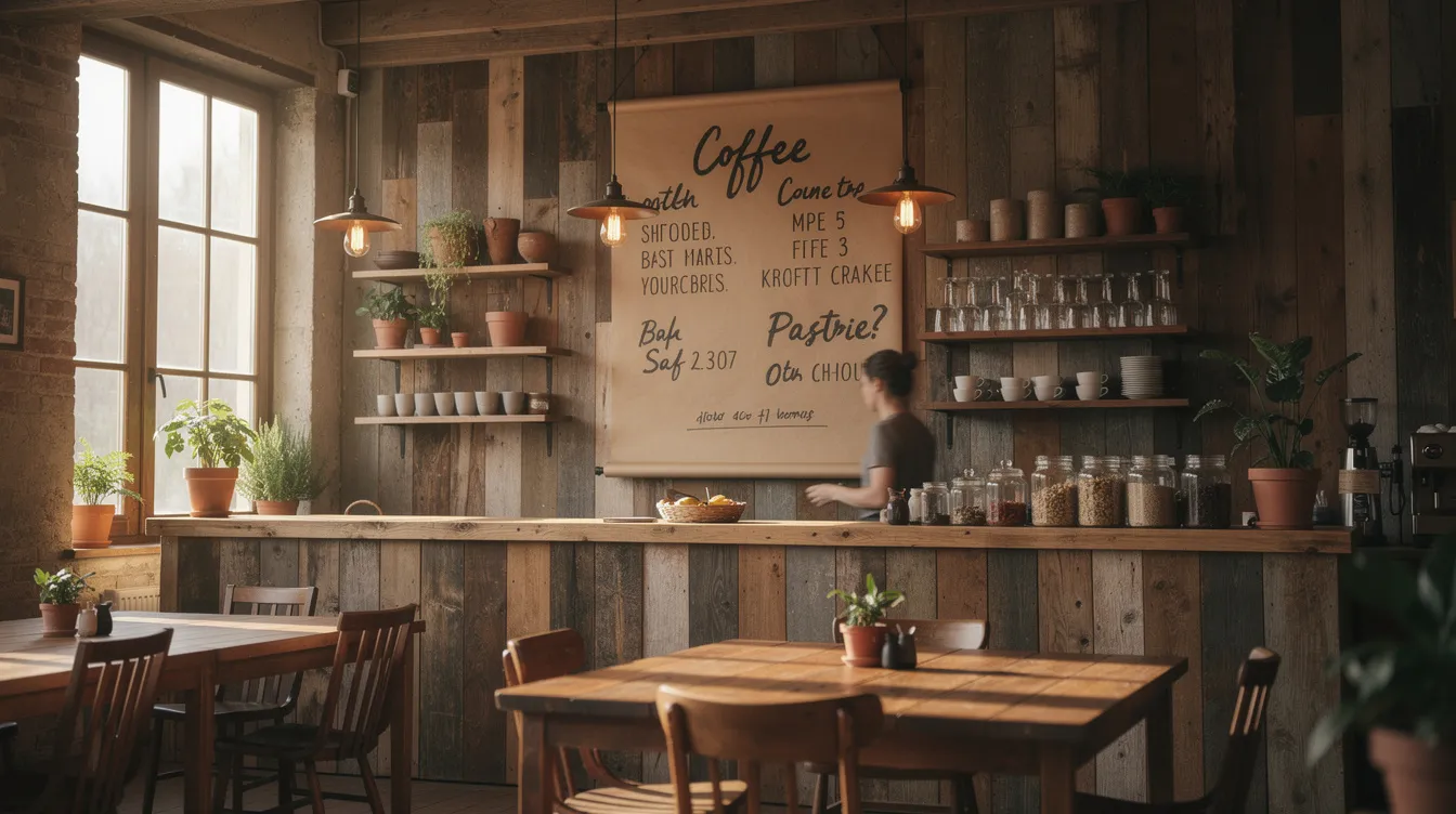
Classic Cafe Menu Board Ideas That Still Work
Some “old-school” formats remain popular in 2026 because they’re affordable, flexible, and perfectly on-brand for cozy, artisan-focused cafes. Adding fun, playful elements to classic menu board designs can enhance the customer experience and make your cafe more memorable. These options deliver personality and functionality without requiring significant investment. Let’s explore concrete, visual ideas and how to execute them on your wall. A well-designed menu board can also be used to explain key offerings or guide customer choices.
Chalkboard Wall with Café-Style Typography
Picture a large wall-mounted chalkboard—roughly 1.5–2 meters wide and 0.8–1 meter tall—positioned behind the counter. This is the archetypal independent cafe setup, and for good reason: it’s inexpensive, infinitely customizable, and telegraphs “handcrafted” from across the room.
Divide the board into clear sections: Espresso, Filter, Cold Drinks, Food, Seasonal. Use white chalk for all item names and prices—this provides maximum contrast and readability from 3–4 meters away. Introduce 1–2 accent colors (muted yellow, teal, or soft coral) only for section headings and limited highlights like “New” or “Seasonal.” Avoid rainbow palettes; they create visual noise.
Keep typography consistent: simple block letters for items and prices, with a slightly stylized but still legible script for section titles only. Overly decorative fonts look charming up close but become illegible from the queue.
Dedicate a small area—perhaps a lower corner or side panel—for “Today’s Bean” or “Roaster Profile” with origin, process, roast date, and tasting notes. This appeals to specialty coffee enthusiasts without cluttering the main menu.
Maintenance matters: chalkboards ghost over time, showing shadows of old text. Plan for a weekly wipe-down and refresh. If hand-lettering isn’t your strength, consider hiring a local chalk artist quarterly to reset the board professionally.
Individual Chalkboards for Flexible Layouts
Instead of one massive board, some cafes mount several smaller framed chalkboards (A3 or 40×60 cm) in a grid or slight stagger. Each board carries one category: Coffee, Tea, Pastries, Brunch. This approach works especially well in narrow spaces where a single long board would require customers to scan uncomfortably far left and right.
Because each board can be lifted off and rearranged, you can reorganize when you introduce a new category. For example, swap in an “Iced Summer Drinks – June–August” board each season, then remove it when the weather cools.
Keep each individual board focused on 5–10 items maximum, with prices aligned on the right edge for quick scanning. Use consistent frame materials—oak, walnut, or black powder-coated metal—so the composition feels intentional rather than random. Hidden French cleats or easy-lift hooks make rearrangement simple.
Pegboards and Letterboards for a Retro Vibe
Black felt or natural-wood pegboards with white plastic letters evoke a 1960s–1970s station or diner aesthetic. This style immediately stands out and photographs beautifully for social media.
Given the fiddly nature of inserting letters, this format works best for essential items only—espresso drinks, key teas, and top pastries. Full drink details can live on printed hand menus or QR codes. Group drinks vertically by base (Espresso, Milk-Based, Filter, Iced) and keep lines short to avoid cramped text.
Add one bold horizontal strip or colored peg row between categories to improve readability from 2–3 meters away. This simple visual separation helps customers browse faster.
This letterboard style pairs nicely with split-flap displays later: both share a tactile, typography-forward feel that can define your cafe’s visual identity.
Brown Paper Roll Menus for Seasonal Changes
Mount a 60–90 cm wide kraft paper roll above the counter with a simple black steel bar and a weighted bottom dowel. When unrolled to about 1.2–1.5 meters, it frames a tall column of handwritten text that screams “fresh” and “temporary.”
Use thick black markers or paint pens for headings and pricing, leaving generous line spacing for readability. Reserve this paper roll specifically for fast-changing items: lunch sandwiches of the day, soup options, seasonal pastries, and limited-time drinks.
Encourage occasional redesign—perhaps monthly—where the entire sheet is torn off, photographed for social media, and replaced with a fresh layout. Add small doodles (croissants, coffee cups, leaves) if your lettering skills allow. This format is inexpensive and highly Instagrammable when done well.
Modern Digital Menu Board Ideas for Cafes
Digital menu boards went mainstream around 2020–2024, and by now they’re common even in small specialty cafes with just one or two screens. The price of commercial and consumer displays has dropped significantly, and cloud-based content management makes updates instant.
Integrating digital menu boards with POS systems enables real-time updates, seamless inventory management, and more efficient operations for modern cafes.
“Digital” here means using screens driven by media players, including smart TVs, mini PCs, or dedicated signage devices. Let’s explore three practical layout patterns that cafes are using effectively today.
Single-Screen Digital Menu Behind the Counter
A landscape 43–55 inch screen mounted slightly above eye level, aligned with the POS area, showing a clean menu with high contrast. This is the simplest digital setup—one screen, one purpose.
Divide the screen into 2–3 columns: Espresso Bar, Non-Coffee, Food. Use clear headings and list no more than 8–10 items per column. Large font sizes (minimum 28–32 px equivalent) ensure guests can read from 3–4 meters away. High-contrast color schemes—light text on dark background or dark text on light—work best under varied lighting conditions.
Add subtle motion sparingly: a slow fade between two background textures, or a gentle highlight animation around the “Seasonal Latte” every 20–30 seconds. Avoid flashy transitions that distract from reading.
Test your content under daylight glare from cafe windows. Matte screens and careful positioning prevent washout; adjust brightness settings for different times of day.
Split-Screen Layout: Menu + Visual Storytelling
A popular layout dedicates roughly 70% of the screen width to menu items and prices, while the remaining 30% rotates high quality images or short looping clips. This smaller panel might showcase pour-over brewing, latte art in progress, behind-the-scenes roasting footage, or close-ups of current pastries.
Align visual content with real time: morning clips focus on espresso and bakery items, while late afternoon shows iced drinks and snacks. Use simple, consistent transitions (crossfade every 8–10 seconds) so the moving content attracts attention without overwhelming.
This layout works well for cafes with limited wall space where only one screen is feasible. You get both clarity and atmosphere in one place, turning your menu display into something that design contributes to the overall atmosphere.
Day-Parting and Time-Based Menus
Digital systems can automatically switch layouts at set times. For example:
- 7–11 a.m.: Breakfast focus—coffee, espresso drinks, pastry combos
- 11 a.m.–3 p.m.: Lunch emphasis—sandwiches, soups, meal deals
- 3–7 p.m.: Afternoon pick-me-ups—iced drinks, sweet snacks, slower drinks like pour-overs
Each daypart menu should be minimal, showing only what’s relevant. This prevents menu overload and lets you hide irrelevant items at the wrong time of day, reducing decision fatigue for consumers.
Consider seasonal day-parting too: a winter menu appearing automatically from November through February with hot chocolate flights, spiced lattes, and warming food. Use slightly different color accents for each daypart (warm tones for morning, cooler tones later) while keeping typography consistent.
Standout Concept: Split-Flap Digital Menu Boards (SplitflapTV)
Split-flap displays—the flipping-letter boards once common in European train stations and airports from the 1950s–1990s—carry powerful nostalgia, rooted in the history and evolution of split-flap displays. Each character is formed by rotating mechanical flaps, creating a distinctive clicking sound and kinetic motion that’s instantly recognizable.
Traditional mechanical split-flap boards are expensive to build and maintain, making them impractical for most hospitality settings, due to the complex mechanics of traditional split-flap display boards. But digital emulations like SplitflapTV recreate this look and sound on modern screens, offering the charm of analog with the power of software. You get a unique, conversation-starting menu display that also functions as live, dynamic signage—no custom hardware required, just an existing TV and a compatible media player, similar to other digital split-flap display boards that actually work.
For cafes that want to stand apart from generic static TV menus while maintaining digital flexibility, split-flap style signage occupies a compelling middle ground and reflects how split-flap displays are making a comeback in digital spaces.
Why Split-Flap Style Works So Well in Cafes
- Emotional appeal: Guests associate split-flap boards with travel, discovery, and a sense of occasion. This fits perfectly with specialty coffee culture, where single-origin beans tell stories of distant farms and careful processing. The board’s aesthetic whispers “journey” and “destination”—exactly the narrative many roasters want to convey.
- Kinetic effect: The flipping animation naturally captures the eye when you switch a special, announce “Fresh batch of cinnamon buns,” or rotate to a new origin. Unlike static TV menus that customers learn to ignore, departure-board-style split-flap motion cuts through habituation.
- Minimalist, text-first design: Each row has limited characters, encouraging concise names and clear pricing. All-caps, monospaced lettering is highly legible from a distance.
- Auditory signature: The characteristic sound, if enabled through speakers at low volume, can become part of the cafe’s ambience during quieter off-peak hours.
Practical Cafe Use-Cases for SplitflapTV
- Morning opening sequence: At 6:59 a.m., the board shows “CLOSED” or a minimal idle message. At 7:00 a.m., a scheduled event triggers the board to flip to “NOW BREWING” and then to the main menu. Regulars come to associate that flipping sequence with doors opening—it becomes a ritual.
- Fresh-baked announcements: At 10:30 a.m., the pastry case refills with cardamom buns. A barista taps a preset, flipping one row to “FRESH CARDAMOM BUNS – JUST OUT 10:30.” The motion draws attention from everyone in the room, driving impulse purchases without any verbal pitch.
- Rotating single-origin coffees: Each time a new hopper is loaded or a pour-over option changes, trigger a quick flip to display the new origin and tasting notes. “ETHIOPIA GUJI – CITRUS / BERGAMOT” appears character by character, giving the moment ceremony.
- Time-based promotions: A lower row or side panel can show real-time promos that appear automatically: “AFTERNOON SPECIAL (15:00–17:00): ICED LATTE + COOKIE €5.50.” At 17:01, it flips back to a different default.
- Multi-screen deployment: Use one main split-flap screen behind the bar for core drinks, plus a smaller flipping column near the pastry counter for dessert highlights. The consistent aesthetic ties both areas together.
Designing an Effective Split-Flap Menu Layout
- Use a grid with clear rows for categories (ESPRESSO, FILTER, COLD DRINKS, PASTRIES) and fixed-width columns for item names and prices.
- All-caps, monospaced or evenly spaced lettering works best.
- Keep character limits per line in mind—long names may need abbreviation or creative line breaks.
- Limit each category to the core 5–7 items you most want to push, keeping the board clean and easy to scan.
- Use flipping transitions only when necessary—when a special changes, when you switch dayparts, or when something new arrives. A maximum of 4–6 flips per hour maintains drama.
- Harmonize on-screen colors with your store’s interior design for a cohesive look.
Hybrid Menu Board Ideas: Mixing Analog Warmth with Digital Flexibility
Some of the most compelling cafe interiors in 2024–2026 mix physical texture—wood, chalk, paper—with controlled digital elements. This isn’t compromise; it’s synergy. The analog pieces provide warmth and handmade appeal, while digital handles dynamic content that would otherwise require constant manual updates.
The goal is cohesion: fonts, colors, and naming conventions should match so the menu feels like one integrated system, not a patchwork. Done well, hybrid setups also allow step-by-step migration—start analog, add digital later without redoing everything.
Big Chalkboard + SplitflapTV Feature Strip
Layout: A wide chalkboard (2–2.5 m) carries the full, stable menu behind the counter. To one side, a narrow vertically-mounted 32–43 inch screen runs SplitflapTV.
- The chalkboard holds core drinks and pastries that rarely change, written in permanent or semi-permanent chalk marker. It’s your anchor—familiar, readable, cozy.
- The SplitflapTV strip rotates through daily specials, new syrup flavors, guest roasters, and time-limited promotions. Whenever something flips, baristas can casually mention it: “You saw the board—our pistachio latte is back today.” The motion naturally draws eyes without requiring any sales pitch, and newer versions can even support split-flap TV with flipping pictures for logos or featured items.
- Ensure the color palette and typography between chalkboard and split-flap are aligned for a unified look.
Printed Main Menu + Digital Split-Flap for Prices and Availability
Layout: A high-quality printed wall menu (on Dibond, wood, or acrylic) lists item names and categories only—no prices. A SplitflapTV panel sits immediately next to or below it, showing current prices and availability.
- This approach lets cafes change prices, add surcharges (oat milk +€0.50), or handle supply issues (“OAT MILK UNAVAILABLE TODAY”) without reprinting anything.
- Clearly label the split-flap area with a small static sign like “TODAY’S PRICES & AVAILABILITY” to orient guests.
- The printed board handles the “what,” and the digital board handles the “how much right now”—a clean division of responsibilities.
Menu Board Placement and Size: Maximizing Visibility and Impact
Choosing the Best Spot for Your Menu Board
Where you position your menu board can make or break the customer experience in your cafe or restaurant. The most effective menu boards are placed where customers naturally pause—typically while waiting in line or approaching the counter. For example, a wall-mounted menu board directly above or behind the counter ensures that every guest can browse menu items as they move through the queue. Hanging boards near the entrance can also catch the eye of customers as soon as they walk in, setting the tone for their visit.
Interactive touchscreen menu boards are becoming increasingly popular, especially in modern cafes. These should be installed at a comfortable height and angle, allowing customers to explore the menu, browse categories, and even customize orders without feeling rushed. The key is to keep the menu board within the main sightline of your customers, ensuring it’s visible from all major areas—whether they’re seated, standing in line, or waiting for their order. By thoughtfully placing your menu board, you not only streamline the ordering process but also boost customer satisfaction and encourage purchasing by making it easy for everyone to see what’s on offer.
Sizing Guidelines for Different Cafe Layouts
The right size for your menu board depends on your cafe’s layout and the number of menu items you need to display.
- In smaller cafes, a compact menu board with a focused, well-organized menu design can be highly effective—think a single chalkboard menu or a concise digital menu board that highlights your bestsellers and daily specials.
- For larger spaces or cafes with extensive offerings, consider a bigger menu display or multiple boards, possibly combining traditional boards with digital menu boards to showcase promotions and seasonal changes.
When planning your menu board, factor in the distance between the board and where customers will be reading it. As a rule of thumb, use a font size of at least 2–3 inches tall for main menu items to ensure readability from across the room. Chalkboard menus and traditional boards can be paired with digital menu boards to create a layered, visually appealing menu display that draws attention to daily specials and limited-time promotions. The goal is to create a menu board that’s easy to scan, visually balanced, and tailored to your specific space—helping customers make quick, confident decisions.
Sightlines, Lighting, and Accessibility Considerations
To maximize the impact of your menu board, pay close attention to sightlines, lighting, and accessibility.
- Place your menu board at a height that’s comfortable for most customers to read—typically just above eye level for those standing at the counter.
- Avoid locations where pillars, decor, or equipment might block the view.
- Good lighting is essential: illuminate your menu board evenly, steering clear of harsh spotlights or direct sunlight that can cause glare and make menu items hard to read.
Accessibility is another crucial factor in menu board design.
- Use high-contrast colors and clear, legible fonts to ensure your menu is readable for everyone, including customers with visual impairments.
- For example, pairing a dark background with bright white or yellow text can make a world of difference.
- If you’re using digital menu boards, adjust brightness and contrast throughout the day to adapt to changing light conditions.
- Consider the needs of all your customers—installing menu boards at a height accessible to wheelchair users, and ensuring interactive screens are easy to reach and navigate.
By carefully considering placement, lighting, and accessibility, you create a menu board that not only looks great but also enhances the overall atmosphere of your cafe. The right menu board design and placement can increase customer satisfaction, encourage purchasing, and contribute to a seamless, enjoyable customer experience from entry to order.
Design Tips for Clear, High-Converting Cafe Menu Boards
Regardless of format—chalk, paper, digital, or split-flap—the same menu design principles apply if you want clarity and higher average spend. These aren’t abstract theories; they’re practical tactics you can apply today. The following tips are relevant for both cafe and restaurant menu boards, which serve as visual tools for enhancing menu presentation and promoting daily specials.
Keep It Readable from Across the Room
- Choose clean, sans-serif fonts for digital and print, or simple block lettering for chalk. Reserve decorative scripts for very short headings only—anything longer becomes illegible from the queue.
- Test legibility: Print or draw a sample at intended size, hang it at actual installation height, then stand 3–4 meters away. If any item name or price isn’t instantly readable, increase the font size or adjust contrast.
- Use sufficient contrast: light backgrounds with very dark text, or vice versa. Avoid mid-tone text on mid-tone backgrounds—they disappear under overhead lighting or window glare.
- In bright cafes with large windows, digital brightness and anti-glare screen positioning matter at least as much as font choice. Test at multiple times of day.
- Limit font variations to two: one for headings, one for body text. More than that creates visual noise and slows comprehension.
Organize Menu Items Logically
- Grouping by drink type (Espresso, Filter, Cold, Tea, Food) beats alphabetical order for most guests. People browse categories they’re interested in, not random letter sequences.
- Place high-margin signature drinks and combo offers near the center of the board or at natural eye level. This “priority placement” draws attention without feeling manipulative.
- List standard sizes and price differences clearly once per category (e.g., “8oz / 12oz / 16oz”) instead of repeating them for every single drink. This reduces clutter and makes comparison effortless.
- Give each category a brief descriptor if helpful: “Filter – rotating single origins, V60 or batch.” This sets expectations and highlights specials to the right audience.
- If the board feels crowded, remove low-selling items from the wall and keep them on printed menus or QR codes only. Less is more when customer satisfaction depends on quick, confident decisions.
Highlight Specials and Seasonal Items Without Overdoing It
- Choose one consistent method for emphasis: a colored box, underline, star icon, or split-flap animation—but not all the elements at once. Multiple competing highlights create confusion about what’s actually special.
- Limit active promotions to a handful per daypart: one seasonal latte, one cold drink feature, one food item. More than that dilutes the impact.
- With split-flap boards, the flipping motion itself is the highlight. Use flips sparingly to maintain their power. If everything flips constantly, nothing stands out.
- Tie seasonal board designs to calendar dates—autumn spice palette from late September, winter menu from early December. Promote limited-time items with clear end dates (“Available until June 30”) to create urgency without feeling pushy.
Implementing Your New Cafe Menu Board: Steps and Checklist
You’ve got inspiration—now let’s turn it into action. This roadmap takes you from idea to installation over a 2–4 week period, depending on complexity.
From Concept to Live Board
- Audit your current situation: What confuses guests now? Where do they hesitate, ask repeated questions, or miss key offers? Baristas are your best source of anecdotal data—they see friction points daily.
- Decide analog vs digital vs hybrid: Consider how often your menu changes, how many dayparts you run, and your budget. If you’re eventually planning SplitflapTV, start with a hybrid approach: chalk for stability, digital strip for flexibility.
- Pick specific formats: Based on your cafe’s style and operations, choose the combination that fits. For example: main chalkboard + SplitflapTV feature strip, or printed board + digital price panel.
- Create a scaled sketch: Draw or digitally mock up your wall, including dimensions, eye-level lines, and rough text. This prevents discovering during installation that everything doesn’t fit.
- Set a target go-live week: Ideally tie it to a natural menu refresh—new seasonal drinks, a guest roaster launch—to create buzz and justify the change.
- Soft launch: Run the new board for a few days before announcing anything. Observe lines, listen for common questions, and tweak confusing labels or missing items.
- Promote: Share photos or short video of the new board on social media. If using SplitflapTV, a 10–15 second clip of the flipping animation will perform exceptionally well.
Ongoing Maintenance and Updates
- Assign responsibility to one team member—or one role—for keeping the board accurate. Unclear ownership leads to outdated prices and sold-out items still listed.
- Establish a regular review cadence:
- Daily quick check: Before opening, ensure out-of-stock items aren’t still displayed
- Monthly deeper review: Evaluate sales data for featured items, remove low-performers, test new offerings in their place
- Digital solutions like SplitflapTV make adjustments instant—supply issues, cost changes, or roasting schedule shifts can be reflected in seconds, not hours.
- Track a few simple metrics before and after changes: sales of featured drinks, average ticket size, and barista feedback on customer questions. You won’t isolate exact causation, but directional improvements plus staff observations will inform future decisions.
- Keep a simple version history or photo folder of previous layouts. Successful seasonal formats can be recycled next year, saving design time and capitalizing on what worked.
Key Takeaways
- Your menu board is the most-viewed signage in your cafe, shaping decisions in under 30 seconds
- Traditional boards (chalk, letterboard, paper roll) work well for stable menus and artisan aesthetics
- Digital menu boards excel when prices, dayparts, or items change frequently
- Split-flap digital signage (SplitflapTV) offers a unique middle ground: nostalgic charm with instant flexibility
- Hybrid approaches—combining analog warmth with digital updates—create the most compelling experiences
- Clear hierarchy, strong contrast, and limited emphasis always beat decorative complexity
- Test everything from 3–4 meters away before committing to final layouts
Your menu board works for you every hour you’re open. Whether you’re freshening up a classic chalkboard, installing your first digital screen, or making a statement with split-flap animation, the principles remain the same: clarity first, strategic emphasis second, and consistent updates always. Start with one small improvement this week—test legibility, add one highlighted special, or explore what SplitflapTV could look like in your space. Your customers (and your sales) will thank you.