Retro Digital Signage That People Actually Notice
March 6, 2026 · Captain
The sign by the register is doing too much.
It is trying to answer the Wi‑Fi question, explain the return policy, announce the seasonal special, apologize for the out-of-stock item, and point people toward the restroom. In most shops, that turns into a familiar collage – taped paper, a fading poster, a sharpie note on neon card stock. It communicates, technically. It just does it with all the elegance of a junk drawer.
A retro digital signage display is what you reach for when you want the opposite: information that updates instantly, but feels intentional. Not “more screens,” not “more marketing,” but a piece of visual theater that earns attention and keeps your space looking designed.
What “retro digital signage display” really means
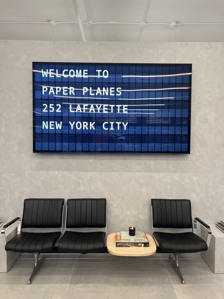
Most digital signage is built around brightness, motion, and generic templates. Retro digital signage borrows a different playbook. It takes cues from public displays people remember – split-flap boards in train stations, departures clicking over, letters snapping into place with a mechanical rhythm.
That split-flap language matters because it behaves differently in the room. It is legible from a distance, constrained enough to stay tidy, and animated in a way that feels purposeful rather than noisy. Even when it is running on a modern screen, it keeps the disciplined grid and the satisfying “changeover” moment that makes people look up.
It is also inherently functional. Those old boards were built to reduce confusion in crowded spaces. When you bring the style forward digitally, you get the same benefit: information that reads fast, updates fast, and still looks premium.
Why retro beats “another TV on the wall”
Attention is scarce in customer-facing spaces, and customers are selective about what they’ll process. A generic digital menu loop can become background in a week. A retro-styled display tends to stay noticeable because it feels like an object, not an advertisement.
There’s psychology in the constraint. The grid forces you to choose what matters. The typography is built for scanning. And that click-clack animation – even when it is visual only – signals a change. Humans are wired to notice changes in patterned environments.
There’s also brand signaling. A retro digital signage display communicates taste. It says someone cared enough to choose a display with a point of view. For boutiques, cocktail bars, hotels, and offices that want to feel curated, that matters as much as the message itself.
The best places to use a retro digital signage display
Retro styling is not a costume you paste onto every wall. It works best where the information changes and the customer benefit is immediate.
In restaurants and bars, it shines when you have rotating specials, limited items, happy hour windows, or a kitchen that needs to 86 something without reprinting a menu. The display becomes a calm, authoritative source of truth.
In retail, it works at decision points: near the entrance for hours and events, near the register for returns and pickup instructions, or in fitting areas for styling notes and promos that do not belong on a handwritten sign.
In boutique hotels, the format is perfect for lobbies and elevators: check-in notes, quiet hours, breakfast times, shuttle reminders, and small moments of local guidance that reduce repetitive questions at the desk.
In offices and coworking spaces, it does the unglamorous work beautifully: meeting room schedules, visitor greetings, team updates, and wayfinding – all without looking like corporate AV.
The common thread is simple: a retro digital signage display earns its spot when it lowers friction and elevates the space at the same time.
What to show (and what not to)
Retro displays are at their best when you respect their restraint. The goal is not to cram every announcement into one board. The goal is to pick the messages that are either time-sensitive or frequently asked.
Start with the “repeated questions.” Wi‑Fi name and password, hours, restroom arrow, pickup instructions, today’s special, event start time. If your staff hears it ten times a shift, the display can answer it once – clearly and consistently.
Next, add “inventory reality.” If a popular item is out, a clean line of text prevents awkward conversations and wasted time in line.
Then add “timed offers.” The retro format is ideal for scheduled messages because it feels official. Happy hour reads differently when it is presented like a departures board rather than a social post.
What not to show: long paragraphs, dense legal text, or a carousel of marketing slogans. The more you treat it like a billboard, the less it behaves like a helpful public display. If the customer needs more than three seconds to understand the message, it belongs elsewhere.
Design choices that make it look expensive (without trying)
A retro digital signage display can look like a museum piece or like a gimmick, and the difference usually comes down to proportion and pacing.
Keep the layout breathable. A grid with enough margin looks intentional. A grid that is packed to the edges looks like an error message.
Choose contrast that matches the room. High contrast is great for daylight and readability, but “bright white on black” can feel harsh in a low-lit bar. Softer tones can still be crisp if the font and spacing are right.
Pacing matters as much as color. Split-flap-style animation is satisfying because it is decisive. If the content flips too fast, it becomes jittery. If it flips too slow, it feels broken. Aim for a cadence that mirrors how a person reads a room – a moment to notice, a moment to understand, then a change that signals “new information.”
Sound is a real trade-off. The click-clack is pure charm in the right environment, but it can be distracting in quiet spaces or near a host stand during a rush. Some venues love it for the theater. Others prefer silent animation. Neither is “correct.” It depends on whether the sound adds delight or adds friction.
The operational side: how to run one without babysitting it
The promise of digital signage is control, but control only helps if it is easy during a busy shift.
The best setups are cloud-managed so you can update content from your phone or back office without touching the screen. Scheduling is where retro digital signage becomes a real business tool. Breakfast hours should appear only in the morning. Happy hour should turn on automatically. Event messaging should expire on its own.
If you manage multiple locations, consistency becomes the win. A single system that lets you push brand-standard layouts while still allowing local updates keeps your signage from drifting into chaos.
Also think about “who owns the update.” If the display requires a marketing manager to log in, it will lag. If a shift lead can change the special in seconds, it stays accurate. Accuracy is what earns customer trust.
Hardware and placement: the unglamorous details that matter
A retro digital signage display can run on different screen sizes, but the placement is more important than the spec sheet.
Mount it where eyes naturally go when people pause: the register line, the host stand queue, the lobby waiting area, the hallway before meeting rooms. If customers have to hunt for it, it becomes decor instead of communication.
Avoid glare, especially near front windows. Retro-style grids rely on legibility. Reflection kills the effect.
Size should match reading distance. A small tablet display can be perfect at a counter for pickup instructions. For a menu board or lobby notice, you want enough scale that the grid reads from several steps back.
Finally, consider redundancy. If the display is your single source of truth for something critical (like hours during holidays), make sure the update process is reliable and simple. Retro charm is great. Missing information is not charming.
When retro is the wrong move
Not every business needs this aesthetic.
If your brand is aggressively minimalist and you never change messaging, a static sign might be cleaner. If your content needs photos, detailed product education, or complex diagrams, the split-flap language will feel limiting.
And if your environment is already visually loud – multiple TVs, lots of motion graphics, flashing lights – adding another animated element can create fatigue. Retro signage works best when it gets a little space to breathe.
The constraint is the feature, but it is still a constraint.
Bringing it to life with modern control
The sweet spot is when the retro look feels authentic while the workflow feels modern. That is why screen-based split-flap experiences have become such a smart alternative to mechanical boards – you get the nostalgia and the public-display theater without inheriting the maintenance routine.
If you want a ready-to-run version of this concept, Split Flap TV is built specifically around that idea: a split-flap-style display you can buy as a prepared screen, then control through a subscription app for layouts, scheduling, and live feeds, with optional click-clack sound for the full effect. It is the retro moment, minus the handwritten signs and last-minute print jobs.
A retro digital signage display is ultimately a promise you make to customers: the information here is accurate, and it will be presented with care. Treat it like part of your space – not an afterthought – and it will do what the best signage always does. It will answer questions before they get asked, and it will make people feel like they walked into a place that has its details handled.