Split-Flap Animation Generator, Done Right
March 5, 2026 · Captain
That moment when the letters flip and land – click, clack, click – is basically a magnet for eyeballs. It is theater, but it is also information delivery at its most confident: arrivals, hours, daily specials, Wi‑Fi, room numbers, queue status. If you have ever watched a guest step closer just to see the next change, you already understand why the look endures.
A split flap animation generator is the modern way to recreate that mechanical split-flap feeling without the maintenance, weight, and limitations of physical hardware. Instead of gears and flaps, you get software-driven animation that runs on TVs and tablets, updates instantly, and still gives you the satisfying rhythm of a board coming to life.
What a split flap animation generator actually does
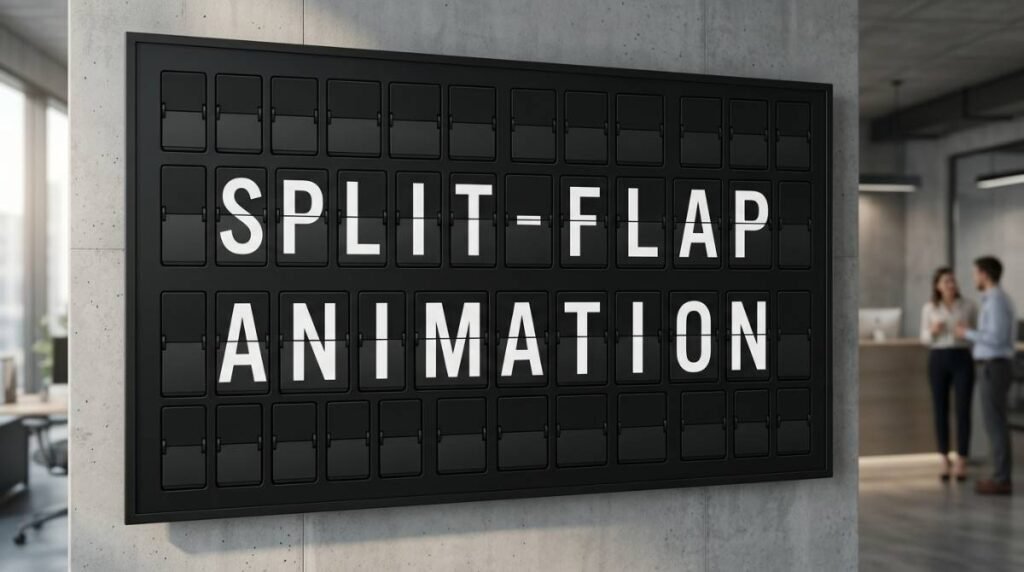
Classic split-flap boards are clever machines. Each character is a little stack of flaps, and when the display updates, those flaps cycle until the right letter faces front. The charm comes from the journey, not just the destination. You see the message arrive.
A generator simulates that journey. It takes your target text, compares it to whatever is currently on screen, and animates the “flip” sequence so the characters roll into place. Better generators mimic the small details your brain expects: slight staggering across columns, a consistent cadence, and that brief moment of almost-legibility as letters pass through.
For businesses, the practical point is simple: you get a display style people recognize instantly, but you are not locked into a static sign or a tedious reprint cycle. You can change the message mid-shift, schedule it for later, or swap layouts for different dayparts.
Why this animation style pulls attention in public spaces
Most digital signage fails for one reason: it looks like signage. It fades into the background because it behaves like every other screen.
Split-flap behavior is different. The motion is purposeful, the typography is bold, and the update is event-like. When the board flips, people look up. In busy venues, that attention is valuable because it reduces repeated questions at the counter and helps guests self-serve information.
There is also a design advantage. Split-flap is naturally constrained: rows, columns, and a limited character set. That constraint is a gift when you are trying to communicate clearly from 10 feet away. It encourages short, readable messages instead of clutter.
Where a generator fits best (and where it doesn’t)
If your information changes often, split-flap animation is a strong fit. Menus, rotating specials, event schedules, meeting room names, wayfinding, arrival boards, and queue messaging all benefit from “refresh moments” throughout the day.
If your signage is mostly decorative and rarely changes, the animation can be overkill. You might still love the look, but you will not be using the thing that makes it special: updates that feel alive.
It also depends on your environment. A quiet boutique hotel lobby may want subtler timing and fewer flips. A bar, coffee shop, or high-traffic retail floor can lean into the energy with more frequent changes and bolder pacing.
The real decision: animation file vs. live generator
When people search for a “split flap animation generator,” they often mean one of two things.
Some are looking for a one-time exported video or GIF that looks split-flap-ish. That can work for a social post or a single loop on a screen, but it becomes painful fast if you need to keep information accurate. Every change means editing, re-exporting, and redeploying.
Others want a live generator – a system that creates the animation dynamically from editable text. That is what you want for operational signage. You can update from a phone or laptop, schedule changes, and keep messaging consistent across locations.
If your goal is “set it once and never touch it,” a file might be fine. If your goal is “make it correct in 30 seconds during a rush,” you want a live generator.
What to look for in a split flap animation generator
A good generator is not just pretty. It is predictable, readable, and easy to run day after day.
Start with authenticity. The animation should feel like real split-flap: characters flip through a sequence, settle crisply, and maintain consistent spacing. If it looks like a random dissolve or a generic slot-machine roll, the nostalgia turns into novelty.
Then check control. The best setups let you tune the experience: flip speed, stagger timing, pauses between pages, and whether the board updates all at once or row-by-row. Those details matter because they let you match the vibe of your space. A design-forward lobby wants elegance. A busy counter wants quick clarity.
Readability comes next. High contrast, clean typography, and a grid that fits your viewing distance are non-negotiable. Split-flap looks best when the message is short and bold. If you are cramming long sentences into narrow columns, the style fights you.
Finally, look for operational features that stop signage from becoming another chore. Scheduling is the big one: breakfast hours, happy hour, live events, office announcements, rotating promos. Remote updates matter too, especially if the person who controls messaging is not always on site.
Sound: optional, powerful, and situational
The “click-clack” is half the magic, but not every venue wants audio. In some spaces, sound is a feature that sparks conversation. In others, it becomes noise.
A good generator treats sound as a dial, not a gimmick. You should be able to toggle it, adjust volume, and decide when it plays. Many venues land on a middle ground: sound on during peak moments when the board is part of the atmosphere, off during quiet hours or in meeting-heavy environments.
Designing messages that look great on a flipping board
Split-flap rewards restraint. Think in short blocks and clean hierarchy.
If you are updating a menu, lead with the headline item, then price, then one tight descriptor. If you are answering frequent questions, keep it blunt and helpful: “WIFI: NAME / PASS,” “HOURS: 7-3,” “PICKUP: LEFT COUNTER.” For hotels and offices, directional language works well because the grid reads like a directory.
Timing matters too. The flip is fun, but customers should not have to wait for the board to finish performing. If you have multiple pages, keep them focused and cycle at a pace that matches foot traffic. In fast lines, faster page turns. In lounges, longer dwell time.
Screens and placement: making the effect feel physical
Split-flap works best when the screen feels like a sign, not like a TV showing a sign. Mounting height, framing, and background lighting do a lot of the heavy lifting.
Place the display where people naturally pause: near the point of sale, at the entry, behind the bar, at the elevator bank, or by the host stand. Avoid spots where glare wipes out contrast. If the screen is too high, the board becomes decor. If it is too low, it becomes furniture.
Also consider size relative to distance. Split-flap characters need room. Bigger is not always better, but tiny grids with tiny type lose the iconic look quickly.
Content control: the difference between “cool” and “useful”
The best split-flap experiences are not static. They are managed.
That means you can change messaging during a shift without redesigning anything. It means you can schedule tomorrow’s hours tonight. It means you can keep branding consistent across multiple screens without training every staff member to be a designer.
This is where a split flap animation generator becomes more than a visual trick. It becomes a simple publishing system – one that lets you keep information accurate, reduce taped-up notes, and maintain a polished front-of-house even when things change quickly.
A practical way to evaluate your options
If you are choosing a generator for a real venue, test it like you would test any operational tool. Put it through a normal week.
Ask how quickly you can update a message from your phone. Check whether the layout breaks when you add a longer item. See if scheduling is built in or if you are expected to manually change content each day. Watch it in your lighting conditions, from your customers’ viewing angle, during your busiest hour.
Also ask who owns the workflow. If the only person who can update the board is your one tech-savvy manager, the sign will go stale. The best systems are designed for the people who actually run the shift.
When you want the look without the hardware headaches
Mechanical split-flap boards are iconic, but they are also machines. They require upkeep, parts, and space. Many businesses love the aesthetic but do not want to inherit a maintenance project.
A modern screen-based generator gives you the emotional hit with the flexibility modern operations demand. You can keep the nostalgic charm and still run a clean, current business: accurate info, fast updates, scheduled messaging, and layouts that stay on-brand.
If you want a ready-to-run approach that pairs the split-flap aesthetic with cloud-managed control, Split Flap TV is built for exactly that – plug in the screen, use the app, and publish updates when the day inevitably changes.
What makes split-flap special is not that it looks vintage. It is that it makes information feel intentional. When your signage has presence, your space feels cared for – and customers notice the difference.