Restaurant Signage Templates That Actually Get Read
March 3, 2026 · Captain
The lunch rush is loud, the line is long, and someone still asks, “Do you have a gluten-free option?” The answer is yes. It’s also written on a taped-up note… behind the plant… under glare.
This is the real job of restaurant signage: reduce questions, move decisions forward, and keep your brand feeling intentional even when the kitchen is sprinting. Good digital signage templates do that without asking you to become a designer between shifts.
Why templates matter more than “a screen on the wall”
Restaurants don’t struggle with ideas. They struggle with time, clarity, and consistency. A screen that can display anything often ends up displaying everything: too many fonts, too much motion, too many messages competing for the same attention span.
Templates solve that by baking in hierarchy. They force the question every sign should answer: what do guests need to know first? In a restaurant, that usually means “what can I order, what’s the deal, and what happens next.”
There’s a trade-off, of course. The more flexible a template is, the easier it is to accidentally make it messy. The more locked-in it is, the harder it is to adapt to new promotions or seasonal menus. The sweet spot is a set of templates that share a consistent system (type size, spacing, alignment, timing) but let you swap in new content fast.
Digital signage templates for restaurants: the non-negotiables
Before you pick a style, make sure your templates support the realities of service. “Pretty” is nice. “Readable from 12 feet away while someone holds a toddler” is better.
A usable restaurant template typically does three things well: it keeps copy short without feeling abrupt, it emphasizes the one decision you want a guest to make, and it uses contrast so the message survives bright windows, dim bars, and everything in between.
If your screens are near the point of sale, templates should lean even harder into speed. A guest shouldn’t have to scan a paragraph to understand the daily special. If your screens are deeper in the dining room, templates can afford more storytelling – but still need restraint.
The restaurant template types that earn their keep
You can cover most restaurant needs with a small, disciplined library. You don’t need fifty layouts. You need a few that you’ll actually use every week.
Menu boards that change without collateral damage
The best menu templates assume items will change. Prices change. Seasonal ingredients disappear. New cocktails show up. Your template should make editing a single item feel like changing a label, not rebuilding a whole design.
Look for layouts that keep item names and prices aligned, with descriptions optional rather than mandatory. If you run limited-time offers, build a “featured area” into the template so you’re not cramming a new promo into the margins. And if you’re tempted to add photos to everything, it depends: photos can increase appetite, but they also increase clutter and file wrangling. A clean text-forward menu is often faster, more premium-looking, and easier to keep accurate.
Daily specials that feel like a performance
A special is supposed to feel urgent and alive. Templates help you keep that energy without rewriting a chalkboard at 10:58 a.m.
A strong specials template usually features one hero item (or one hero combo), a short hook, and a clear window of availability. If it rotates every day, consider templates that support scheduling so the right special appears automatically. Nothing kills trust faster than yesterday’s soup still on the screen.
Event and entertainment templates that stop the “Wait, when?” questions
Trivia, live music, happy hour, tasting dinners, watch parties – these are high-interest messages that get lost when they’re buried in a social post.
Event templates should prioritize date and time first, then the promise (what’s happening), then the action (reserve, show up early, ask your server). Keep them consistent week to week so regulars recognize the format instantly.
If you run recurring events, consider templates that include a “series” frame, like “Every Thursday,” with an optional one-off detail for this week’s theme.
Wayfinding and info templates that quietly save your staff
Not every template needs to sell. Some need to prevent interruptions.
Hours, Wi‑Fi, ordering instructions, pickup directions, restroom arrows, policies, and allergy notes are all signage that reduces friction. The best templates for these messages are calm and unambiguous. Minimal motion. Big type. High contrast.
This is also where it pays to think about placement. A beautiful “Order at the counter” sign behind the counter is basically decorative art. The template can be perfect and still fail if it’s not where the confusion happens.
Brand moments that make the room feel intentional
Restaurants live on vibe. Templates can carry that vibe in small ways: a rotating “Now Pouring” list, a welcome message that matches the daypart, or a split-second “thank you” that lands as guests leave.
These aren’t the screens that answer questions. They’re the screens that make people pull out a phone.
If you want that retro public-display theater, a split-flap style treatment hits differently than generic animations. The click-clack rhythm feels like an announcement, not an ad, and it naturally encourages short, punchy copy.
How to choose the right template set for your space
Template selection is less about taste and more about constraints. Start with three practical questions.
First: how far away will guests be when they read it? If it’s a back wall menu board, choose templates with fewer items per page and larger type. If it’s near tables, you can include a bit more detail.
Second: how often does the content change? If you change prices and items weekly, pick templates built for rapid edits and multi-page rotation. If you change content hourly (happy hour, lunch, late-night), scheduling becomes the real feature, and your templates should map to time blocks.
Third: who updates it? If the answer is “whoever’s free,” templates need guardrails. That means consistent font sizes, limited color options, and pre-built spaces for the important stuff. If a marketing person manages content, you can go a little more expressive – but even then, the line between “designed” and “busy” is thin.
Design rules that keep templates from turning into noise
Most signage fails the same way: it tries to say two things at full volume.
Start by limiting each screen to one primary message. You can support it with a secondary detail, but the hierarchy should be obvious from across the room.
Next, treat motion like seasoning, not the meal. Animation can draw attention, but constant movement can make a menu harder to scan and can feel cheap if it’s not intentional. If your display style includes a signature motion – like a split-flap flip – let that be the moment, then hold the message long enough to be read.
Finally, keep your copy written like a human. “Half-price apps 3-5” beats “Enjoy our promotional appetizer discount window.” Templates help you stay consistent, but they can’t save unclear language.
A practical workflow that doesn’t die after week one
Most restaurants don’t need a complicated content calendar. They need a repeatable rhythm.
Build a small library: one menu template, one specials template, one events template, one info template, and one brand moment template. Use the same typography and color rules across all of them so your screens feel like part of the space, not a separate universe.
Then set up scheduling around dayparts. Lunch content shouldn’t rely on someone remembering to swap it out. Late-night promos shouldn’t be visible at 11 a.m. If your system can automate that, it’s not a luxury – it’s accuracy.
Last, make updates a two-minute habit. If edits take twenty minutes, they won’t happen. Templates should be the reason you can update in seconds, not the reason you postpone it until next week.
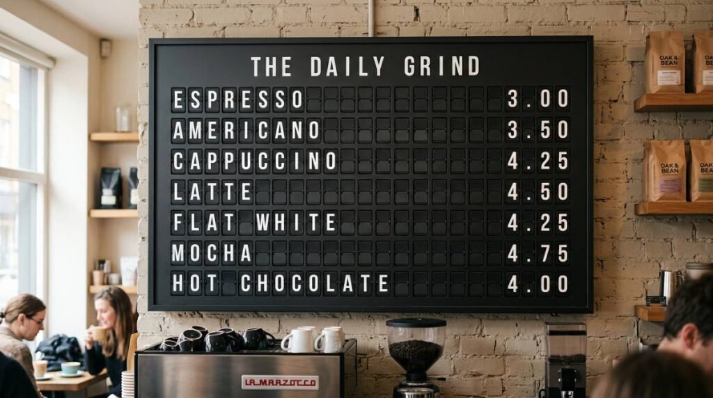
When the template is the vibe: split-flap as a restaurant format
Some display styles are decoration. Split-flap is communication with personality. It’s a format people recognize from airports and train stations, and that recognition makes guests pay attention before they even read the words.
That’s why split-flap templates can work especially well for restaurants: the medium enforces brevity, the flip creates a natural cadence for rotating messages, and the aesthetic feels premium without feeling corporate.
If that’s the direction you want, Split Flap TV offers ready-to-run screens and an app built for configurable layouts, scheduling, and live updates in a split-flap style – the kind of system you can manage without babysitting it during service. You can see the approach at https://splitflaptv.com.
The key is still restraint. Even a beautiful split-flap look can be overused. Put it where it matters: specials, events, “now serving,” or the moments that benefit from announcement energy.
The metric that tells you your templates are working
You’ll feel it on the floor. Fewer repeat questions. Faster ordering. Less staff time spent explaining what’s already written somewhere.
But there’s also a quieter signal: guests start quoting your screens. They mention the special by name. They ask about the event they saw “up there.” They take a photo because the message and the look feel like the restaurant.
That’s the point of digital signage templates for restaurants: not to fill a rectangle with content, but to make the room run smoother while the brand gets sharper.
Closing thought: pick one message you’re tired of repeating out loud, put it into a template tonight, and let the screen do the talking tomorrow.