Our New User Interface: Built for You, With You
November 28, 2025 · Captain
Have you ever wondered what goes into making a tool you use every day better? It’s a journey of listening, learning, and creating with a clear vision in mind. Awesome. We are incredibly excited to announce the launch of the completely redesigned Split-Flap TV user interface, and today, we want to take you behind the curtain to share the story of how it came to be.
This wasn’t just about giving our platform a new coat of paint. It was about reimagining the entire experience from the ground up, with one person at the center of it all: you. From the bustling cafe owner managing daily specials to the hotelier creating a warm welcome, our goal was to build a tool that feels like a natural extension of your workflow. Let’s dive into the journey that brought this new, charming interface to life.
The Vision: Effortless Control, Timeless Charm
Our split-flap displays are all about creating a unique, inviting ambiance. They blend retro charm with modern messaging in a way that captivates customers. But we asked ourselves: does our software deliver that same feeling of effortless elegance?
Our vision was simple yet ambitious. We wanted to create an interface that was:
- Intuitive: So easy to use that it requires almost no learning curve.
- Fast: Allowing you to make changes on the fly, in seconds.
- Inspiring: Empowering you to be more creative with your messaging.
We envisioned a platform where managing your display was as delightful as watching the flaps themselves turn. This vision became our guiding star throughout the entire design and development process, influencing every decision we made, from the layout of the dashboard to the click of a button.
Listening to the Experts: Your Feedback
Who knows what a business owner needs better than business owners themselves? Before we wrote a single line of code, our first step was to listen. We reached out to our amazing community of users—the pub owners, the shopkeepers in travel hubs, and the boutique hotel managers who use Split-Flap TV every day.
We asked questions and gathered invaluable feedback. What did you love? What were your pain points? What features would make your life easier?
Here’s some of what we heard:
- “I need to update my specials quickly during the lunch rush, sometimes from my phone.”
- “I wish I could see what my message will look like before I send it to the board.”
- “Scheduling promotions for the holidays in advance would be a game-changer.”
This feedback was pure gold. It gave us a clear roadmap, highlighting the critical areas for improvement: speed, a real-time preview, and more powerful scheduling. Your insights moved from a wish list to the core requirements of the new design.
From Sketch to Screen: The Design and Testing Process
With a clear vision and a wealth of user feedback, our design team got to work. The process started not on a computer, but with sketches on a whiteboard. We mapped out user flows, aiming to reduce the number of clicks for common tasks. How could we make creating a new playlist a two-minute job instead of a ten-minute one?
Next came the prototypes. We created interactive mockups of the new interface and put them back in front of real users. This testing phase was crucial. We watched as people navigated the new design, noting where they hesitated and where they smiled.
One of the biggest “aha!” moments came during the testing of the new board editor. When a cafe owner’s eyes lit up as they saw their text appear in a live preview on the screen, we knew we were onto something special. They told us, “This removes all the guesswork. I can finally get the message perfect on the first try!” That was the moment the “what you see is what you get” editor became a non-negotiable feature.
We refined, tested, and refined again, making dozens of small but meaningful tweaks based on this real-world testing. This iterative process ensured that the final design wasn’t just beautiful, but also incredibly functional and user-friendly.
The Result: A Platform Built for Your World
The new Split-Flap TV interface you see today is the culmination of this journey. It’s a testament to the power of listening and the commitment to creating a truly user-centric product.
Every enhancement was inspired by the needs of a real business:
- The Streamlined Dashboard: Perfect for the busy hotel manager who needs a quick overview of all scheduled messages for the day.
- The Drag-and-Drop Playlist Manager: Designed for the pub owner who wants to reorder the happy hour specials in a flash.
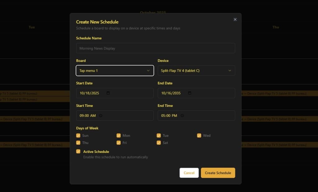
- The “Set It and Forget It” Scheduler: A lifesaver for the shop manager in a railway station who needs to plan promotions weeks in advance.
- Full Mobile-Friendliness: For every user who needs to make an update from the shop floor, not the back office.
We built this for you—to save you time, to spark your creativity, and to help you elevate the charming ambiance of your space. It’s a tool designed to be as durable, reliable, and inviting as our physical split-flap displays.
It’s Your Turn to Explore! We Want to Hear From You
This launch isn’t the end of the journey; it’s the beginning of a new chapter. And we want you to be a part of it. Your feedback started this process, and your thoughts on the new interface will help us continue to make it even better.
We are incredibly proud of what we’ve built, and we truly believe it will make managing your split-flap display a more joyful and efficient experience.
So, what are you waiting for? Experience the new interface for yourself. Explore the new features, play with the editor, and see how much easier managing your display can be. Then, let us know what you think!